Component UI

Project description

tgzr.declare
Component based UI Declaration and Rendering.
For now, Qt is the only supported backend. IMGUI is planned for later.
Please find installation instruction at the end of this page.
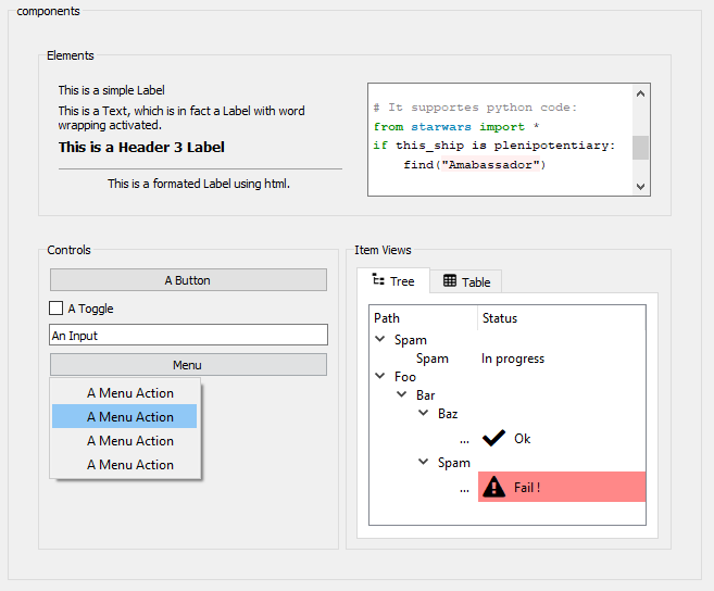
Here is a screenshot of the component section in Qt demo app:
A note on tgzr
tgzr.declare is part of the tgzr comunity powered platform but is completely independent from other tgzr packages and you can use it without any knowlegde of tgzr iteself.
That being said, tgzr is awesone and you should check it out ! ;)
Synopsis
Some parts of your application will declare GUI using components, and parts of you application will render this declaration into an actual GUI.
The declaration is held on an object that you can easily dump to dict or json and re-create from dict or json.
Using a declaration and render your GUI gives you some nice advantages:
- It forces the separation of the logic and the GUI since you can not declare your logic with
tgzr.declare - You can build you declaration in a procedural way without ever subclassing or instanciating anything yourself. This is pretty enjoyable, you should try it !
- Your declaration has a high abstraction level than a GUI library, giving you the opportunity to leveral and streamline the UX delivered to your users.
- The declaration part and the render part of your application may live in different services connected thru the network (REST API, Websocket, grpc, ...)
- Using the
includecomponent, you can build a main GUI composed of several sources (python plugins, other services in you distributed application, ...) - Since can be turn into jsaon, you can store your declaration in a database or in a file, and even let your users customize them !
UI Declaration
In order to declare a UI, you will use a Schema.
Note: As of today, the only supported schema is called 'Default' and can be accessed as
tgzr.declare.default.schema.DefaultSchema. This schema is supported by our Qt renderer:tgzr.declare.qt.renderer.QtRenderer.
A Schema contains all the components you can use with it, along with all the parameters they support. To declare a component, you just need to call it with the parameters you want to use:
from tgzr.declare.default.schema import DefalutSchema as s

my_button = s.Button(label='This is my button')
Some component arguments may need a structure value. For example, every widget-like component of the DefaultSchema have a widget parameter which let you control widget properties like enabled or visible. To set those, you can use a dict, but the easiest way is to use a dotted notation on the component declaration:
from tgzr.declare.default.schema import DefalutSchema as s

# This can be useful programatically:
widget_params = dict(enabled=False, visible=True)
my_button = s.Button(label='This is my button', widget=widget_params)

# This is equivalent and easier when GUI is written by hand:
my_button = s.Button(label='This is my button', widget=widget_params)
my_button.widget.enabled = False
my_button.widget.visible = True
Tip: Your IDE should provide completion for component names as well as component argument ! A great effort has been given for this while developing
tgzr.declareand it is a key part in the pleasure of using it ! If you don't have completion, see how you can tweak your IDE configuration or consider migrating to visual code ;)
In order to build you UI you will want to place some components inside other components. This is achieved by using components as context. Here is an example using the VBox component which lays out its children vertically:
from tgzr.declare.default.schema import DefalutSchema as s

with s.VBox():
  s.Button(label='This is my button')
When your declaration is done, you will probably want to use it. Our first example was assigning the Button component to the my_button variable. When using a component as context, you can specify the variable to assign it to and use it later on:
from tgzr.declare.default.schema import DefalutSchema as s

with s.VBox() as UI:
  s.Button(label='This is my button')

do_something_with_my_ui(UI)
Using this aproach gives you opportinities to split you declaration into separated reusable and potentially procedural functions.
This example has some of the GUI skiped for non-admin users, and delegates parts of the UI declaration to some plugin:
from tgzr.declare.default.schema import DefaultSchema as s

from . import admin_tools
from . import business_stuff

def admin_panel(parent):
    if admin_tools.is_user_admin():
        s.button('Kill the server')

def add_plugin_footer():
    s.Button(label='Submit')

def add_plugin_tab(plugin):
    with s.Tab(label=plugin.name):
        plugin.declare_gui(layout)
        add_plugin_footer()

def get_ui():
    with s.Tabs() as UI:
        for plugin in business_stuff.loaded_plugins():
            add_plugin_tab(parent, plugin)

    return UI
UI Rendering
In order to render your ui, you will use a Renderer and a host.
Note: As of today, the only provided renderer is
QtRendererand can be accessed astgzr.declare.qt.renderer.QtRenderer. This renderer support theDefaultSchemawe've been using in previous examples.
With the QtRenderer, the host can be a simple QWidget:
from qtpy import QtWidgets
from tgzr.declare.qt.renderer import QtRenderer

from .gui import get_gui # a function returning you GUI declaration dict

# Create you app and your host:
app = QtWidgets.QApplication([])
host = QtWidgets.QWidget(None)

# Create your renderer using the host widget:
renderer = QtRenderer(host)

# render you ui, it will be contained in the host:
renderer.render(get_gui())
If you're building an application with a 100% tgzr.declare GUI, you may want to use our Qt App which does all this boilerplate for you. Using the @App.setup decorator, you will receive the app's QtRenderer and have the opportunity to configure and use it:
from tgzr.declare.qt.app import App
from .gui import get_gui # a function returning you GUI declaration dict

my_app = App('My Title')

@app.setup
def setup(renderer):
    renderer.render(get_gui())
Actions
Some components trigger actions. For example, the Button component triggers a clicked action. You will implement your application logic by reacting to action.
To do so, you must set handler functions to your renderer. Those function will receive many information which will help you decide what to do:
# this is the required signature for an action handler:
def my_handler(renderer, key, action, context, *args, **kwargs):
  pass

# this is how you set a handler on your renderer:
renderer.set_handler(
  my_handler, 'some_component_key', 'some_component_action',
)
/!\ We're still in alpha. This signature will probably changed and drop the
rendererargument.
Among the arguements received by you handler, the key one can be used to identify the component which triggered the action. This key can be specified in the component declaration with the key parameter. It defaults to the ID parameter, which in turn defaults to None.
So for example, with this declaration, your handler can act differently if the received key is Ok or Cancel:
with s.HBox():
    s.Stretch()
    s.Button(key='Ok')
    s.Button(key='Cancel')
When setting handlers, you can optionnally specify the key and/or the action to indicate what you want to receive. This is handy to dispatch actions to the appropriate handler:
with s.VBox():
    s.Toggle(label="Allow overwrite")
    s.Button('save_button', label="Save")

def on_toggled(renderer, key, action, context, checked):
    print('Toggled', key, checked)

def on_clicked(renderer, key, action, context):
    print('clicked', key)

def on_action(renderer, key, action, context, *args, **kwargs):
    print('Unhandled action:', key, action, args, kwargs)

renderer = QtRenderer(host)

# This handler will only receive `clicked` actions:
renderer.set_handler(on_clicked, action='clicked')

# This handler will only receive actions from the 'save_button' component:
renderer.set_handler(on_clicked, key='save_button')

# This handler will only receive `toggled` actions:
renderer.set_handler(on_toggled, action='toggled')

# This handler will receive all otherwise not handled actions:
renderer.set_handler(on_action)
Note: There is a default handler in the
rendererwhich will catch all unhandled actions and print the key and the action type. So you can start building your UI and use it to see what it triggers :)
The Handle component
Sometimes your handler code is only performing some UI related logic. In such case, you may want to define your handler direclty in the UI declaration. This is the purpose of the Handle component. It has a script parameter where you can provide a string that will be executed as python code. This script will have interesting informations and functions available (in locals), see its docstring for more details.
For example, this Handle component will enable the Button only if the Toggle value is True:
def add_some_ui(schema):
    with schema.VBox():
        schema.Toggle('Confirm', action_key='confirmation')
        with schema.Button('Submit'):
            schema.Bind(property_name='enabled', state_key='button_enabled')

      # Initial state value:
      schema.State(name='button_enabled', value=False)

      # Handling toggle:
      script = "set_state('button_enabled', args[0])"
      schema.Handler(script=script, key='confirmation')
States
The renderer contains a state store, a dict-like object which can store values associated to a string key.
Binding properties to states
When you need to access a value from your GUI, you will bind a component's property to a state in the renderer's state store. This will ensure the state value and the property value are always syncronized.
Once a property is binded, you can use the renderer to get or set its value.
The binding is done by using a special value for a component's parameter. This value is built using SomeSchema.Bind(property_name, state_key), like this:
my_button = schema.Button(
    schema.Bind(property_name='label', state_key='my_button_label')
)
Since this is a very common operation, there is a shorthand you may prefer:
my_button = schema.Button(label='@binded:my_button_label')
Reading states
Once a property is binded, you can use the renderer to get or set its value.
In this example, we're using two Input components binded to two keys in the state store. The state store can retreive all keys starting with a prefix at once (we call this a namespace). We're leveraging this to turn all the input as the arguments of a callback function create_user():
from tgzr.declare.default.schema import DefaultSchema as s
from my_business import create_user

with s.HBox() as UI:
    s.Input('name', value='@binded:form/name')
    s.Input('email', value='@binded:form/email')
    s.Button('Submit')

def on_submit(renderer, key, action, context):
    create_user_kwargs = renderer.get_states('form/'))
    create_user(**create_user_kwargs)

renderer.set_handler(on_submit, key='Submit')
renderer.render(UI)
Updating State
States are also used to affect the GUI. If you change the value of a state, any property binded to it will update:
from tgzr.declare.default.schema import DefaultSchema as s

# Declare a disabled toggle and a disabled button with their `enabled` property
# binded to the same state:
with s.VBox() as layout:
    with layout.toggle(label='Overwrite', enable='@binded:form_ui/enabled') as toggle:
      toggle.widget.enabled = False
    with layout.button(label='Save', enable='@binded:form_ui/enabled') as button:
      button.widget.enabled = False

renderer.update_states({'form_ui/enabled': False})
renderer.render(layout)

# the ui is disabled...
...
...
# later, this will enable both the toggle and the button:
renderer.update_states({'form_ui/enabled': True})
This can be use on most parameters of the components. Not all are bindable, but their documentation will clearly identify the ones you can bind to states.
Tip For now, the easier way to browse component arguments is the
Documentationview of theGUI Editor. See the dedicated section below...
Declaring States
Your declaration can set state value too !
To do so, you can use the State component:
from tgzr.declare.default.schema import DefaultSchema as s

with s.VBox():
  s.Input(value='@binded:form/name)
  s.Input(value='@binded:form/email)

  s.State(name='form/name', value='bob')
  s.State(name='form/email', value='bob@bob.org')
Tip: Those
Statecomponents may be declared before or after binding to them. But declaring them before hand may reduce the number of updates on GUI startup.
State namespacing
If you are using namespaced states (state keys with a "/" in them), you may want to use the States component.
This is equivalent as the previous example, but the "form" namespace is written only once:
from tgzr.declare.default.schema import DefaultSchema as s

with s.VBox():
  s.Input(value='@binded:form/name)
  s.Input(value='@binded:form/email)
  with s.States(namespace='form'):
    s.State(name='name', value='bob')
    s.State(name='email', value='bob@bob.org')
Using namespaced states is very usefull when you need to gather all the states you will use as arguments for a function or a REST call for example. In the example above, you would be able to call renderer.get_states(prefix='form/') and receive a dict with both the name and email keys.
Structured States
Some component parameters can accept or require a value with structured data.
For example, the columns property of an ItemView can be a list of strings:
columns = ["Name", "EMail", "is_super_user"]
or a list of columns properties:
columns = [
    dict(Label='Name', icon='fa.user'),
    dict(Label='EMail', icon='fa.envelope'),
    dict('is_super_user', hidden=True, icon='fa.user-plus'),
]
The items you want to display in the ItemView is even more complex !
To help you provide the appropriate data, you can use their corresponding components.
Here is an example of Items and Columns you can use on a ItemView.
from tgzr.declare.default.schema import DefaultSchema as s
from my_business import get_user_list

def declare_view_states():
    with s.States(namesapce='my_item_view'):
        with s.Columns('my_columns'):
            s.Column(label="Name", icon="fa.user")
            s.Column(label="EMail", icon="fa.envelope")
            s.Column(label="is_super_user", hidden=True, icon='fa.user-plus')

        with s.Items('my_users'):
            for user in get_user_list():
                with s.Item(user.user_uid) as user:
                    s.Cell(
                        column='Name',
                        value=user.name,
                        icon=user.icon,
                    )
                    s.Cell(
                        column='EMail',
                        value=user.email,
                        background_color=user.email_color,
                    )
                    s.Cell(
                        column='is_super_user',
                        value=user.is_super_user,
                    )
Group
We have seen how the States component can be used to "prefix" the state you're using in a whole branch of your UI declaration.
The same can be done with the Group component. The difference is that it also acts on the component actions !
In this example, the Submit button will trigger a form/Clicked action instead of the default clicked action:
from tgzr.declare.default.schema import DefaultSchema as s

with s.VBox() as UI:
  with s.Group(namespace='form'):
    s.Input(value='@binded:name')
    s.Input(value='@binded:email')
    s.Button(label='Submit)

def on_submit(renderer, key, action, context):
  print('Submitting:', context.get_states('form/'))

renderer.add_handler(on_submit, action='form/clicked')
This is particularily useful once you start composing GUI from different source which don't want to mess with each others' states and actions.
Icons
We're using qtawesome for all icons.
Note: We might migrate to another plaform since we need icon support for other backends than qt, but we will make our best to keep the icon names compatibles and the migration frictionless.
When you see an icon parameter, you must provide a valid qtawesome icon name (there's like 14k icons there, you should be covered ;))
See the qtawesome doc for more details:
https://github.com/spyder-ide/qtawesome#supported-fonts
We're quite found of the font awesome solid collection 5, which you can browse here:
https://fontawesome.com/v5/search?m=free&s=solid
If you installed the Qt backend (see installation instructions below), you will also have a nice icon browser available in you virtualenv with the command:
$ qta-browser
Demo
You can launch the demo with:
python -m tgzr.declare.qt.demo
It will showcase many components with some explainations, totally worth looking at :)
You can also have a look at the player_app demo application, its code can be used to explore all the concepts available in the library:
python -m tgzr.declare.qt.demo.player_app
GUI Editor
We have a rudimentary GUI editor. You can launch it with:
python -m tgzr.declare.qt.editor
You will be presented with 4 panels, from left to right:
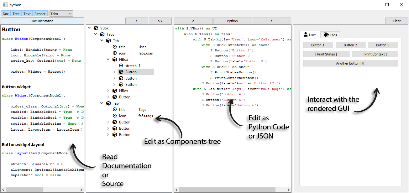
-
Documentation
Select a component in the component tree and its documentation will appear here. Using the button at the top, you can toggle to "Source" mode to see the component source code.
-
Declaration tree
Right click to show a list of components to add. If a component is selected, the new one will be created as a child of it.
You can drag'n'drop component to reorder and reparent them.
Right click a component to access the menu where you will be able to add/remove properties, etc...
The ">" button at the top will load the resulting declaration to the UI view.
The ">>" button will do the same + render this UI in the Render View.
-
UI
Here you can see and edit the UI as python code or as json (use the central button at the top to toggle between the available modes).
Using the "<" button at the top will load the current displayed UI in the Declaration Tree.
The ">" button will render the current displayed UI in the Render View.
-
Render
This panel renders the UI you see in the UI panel.
-
State Tree
This is not available yet but we plan on adding a 5th panel where you'll be able to see and edit the state values in a tree.
DefaultSchema Component List
The lib is still in early alpha and the API will change.
Most notably, the component list and their name in the DefaultSchema both need a curation. We aim at higher level components that we have today.
That being said, here is the list of components currently available in DefaultSchema, along with their parameters:
Click to expand the components list
- Anchor
    - name
    - trigger_state
    - effect

- Anchors
    - name

- Bind
    - property_name
    - state_key

- Button
    - label
    - icon
    - action_key
    - widget
    - widget
        - widget_class
        - enabled
        - visible
        - tooltip
        - layout
        - layout
            - stretch
            - alignment
            - separator

- Frame
    - title
    - checkable
    - checked
    - flat
    - widget
    - widget
        - widget_class
        - enabled
        - visible
        - tooltip
        - layout
        - layout
            - stretch
            - alignment
            - separator

- Group
    - namespace
    - affect_states
    - affect_actions

- H1
    - text
    - word_wrap
    - fixed_width

- H2
    - text
    - word_wrap
    - fixed_width

- H3
    - text
    - word_wrap
    - fixed_width

- H4
    - text
    - word_wrap
    - fixed_width

- HBox
    - debug
    - stretch
    - margins

- Handle
    - script
    - key
    - action

- Include
    - source_state
    - trigger_state

- Input
    - value
    - action_key
    - realtime
    - widget
    - widget
        - widget_class
        - enabled
        - visible
        - tooltip
        - layout
        - layout
            - stretch
            - alignment
            - separator

- ItemView
    - columns
    - items
    - multiple_selection
    - current_item_state
    - selected_items_state
    - group_by
    - auto_group_separator
    - auto_expand_groups
    - sortable
    - filter
    - use_filter
    - decorated_root
    - header_hidden
    - icon_size
    - widget
    - widget
        - widget_class
        - enabled
        - visible
        - tooltip
        - layout
        - layout
            - stretch
            - alignment
            - separator

- Label
    - text
    - word_wrap
    - fixed_width
    - format
    - widget
    - widget
        - widget_class
        - enabled
        - visible
        - tooltip
        - layout
        - layout
            - stretch
            - alignment
            - separator

- Layout
    - debug
    - stretch
    - margins
    - layout_class
    - orientation

- LayoutItem
    - stretch
    - alignment
    - separator

- ListState
    - name

- ListStateAppend
    - value

- Markdown
    - text
    - min_width
    - min_height
    - widget
    - widget
        - widget_class
        - enabled
        - visible
        - tooltip
        - layout
        - layout
            - stretch
            - alignment
            - separator

- Menu
    - label
    - icon
    - popup_at_cursor
    - trigger_state

- MenuAction
    - label
    - icon
    - checkable
    - checked
    - action_key
    - hovered_action_key

- Overlay
    - name
    - visible
    - enabled

- PrintContextButton

- PrintStatesButton

- Set
    - name
    - value

- Splitter
    - orientation
    - widget
    - widget
        - widget_class
        - enabled
        - visible
        - tooltip
        - layout
        - layout
            - stretch
            - alignment
            - separator

- SplitterPanel
    - layout_orientation
    - layout_stretch
    - widget
    - widget
        - widget_class
        - enabled
        - visible
        - tooltip
        - layout
        - layout
            - stretch
            - alignment
            - separator

- State
    - name
    - value

- States
    - namespace

- Stretch

- Tab
    - title
    - icon
    - layout_orientation
    - layout_stretch
    - widget
    - widget
        - widget_class
        - enabled
        - visible
        - tooltip
        - layout
        - layout
            - stretch
            - alignment
            - separator

- Tabs
    - closable
    - movable
    - current
    - widget
    - widget
        - widget_class
        - enabled
        - visible
        - tooltip
        - layout
        - layout
            - stretch
            - alignment
            - separator

- Text
    - text
    - word_wrap
    - fixed_width

- Toggle
    - label
    - value
    - action_key
    - widget
    - widget
        - widget_class
        - enabled
        - visible
        - tooltip
        - layout
        - layout
            - stretch
            - alignment
            - separator

- VBox
    - debug
    - stretch
    - margins

- Widget
    - widget_class
    - enabled
    - visible
    - tooltip
    - layout
    - layout
        - stretch
        - alignment
        - separator
This list was generated by running:
python -m tgzr.declare.default.schema
You will have the list corresponding to your version if you run this command yourself.
Install
For Declaration
Install the bare package if you only need to declare UIs. This install will have no dependency to any backend libraries and will be compatible with headless environments:
pip install tgzr.declare
Note: With this, an ImportError could be raised when importing
tgzr.declare.qtand anything under it. See the 'For Rendering' section below for an installation handling declaration AND rendering.
For Rendering
Install with some extra(s) requirement to specify the backend you want to use. For now, Qt is the only supported backend.
If you have a Qt wrapper install by other mean, just use the qtpy extra:
pip install -U tgzr.declare[qtpy]
If you don't have any Qt wrapper installed, you can add the PySide2 extra:
pip install -U tgzr.declare[qtpy,PySide2]
With these, you will be able to use tgzr.declare.qt.QtRenderer to render your UI.
Note: All
tgzr.declareinstallation can be used to declare some GUI, so those command actually install the declaration AND the rendering parts.
Release history Release notifications | RSS feed

Download files
Download the file for your platform. If you're not sure which to choose, learn more about installing packages.
Source Distribution
Built Distribution
Hashes for tgzr.declare-0.0.1rc1-py3-none-any.whl
| Algorithm | Hash digest | |
|---|---|---|
| SHA256 | 81124a4fc16e2e3224766dcfb4e40a5ebe7be017e0057ecac509d55491f34568 |
|
| MD5 | e492a55882bff77d79bcc5627bdbc9ea |
|
| BLAKE2b-256 | bf86d17b544b5849d0aab629cb2229233bb282aade8db6dd46e48995f7f87aaf |