A Python package for creating UpSet-style plots using the Plotly framework.

Project description
UpSetPlotly
Generate UpSetPlot-style plots with Plotly.
Why another UpSet package for Python?
UpSetPlot is a fine package and is well maintained. I have used it before and haven't had any complaints. The reason I decided to make another package to generate UpSet plots is because another project I'm working on, MhcVizPipe, uses Plotly to generate plots as part of an HTML report. UpSetPlot only uses matplotlib. I wanted to have an UpSet plot in the reports, but I wanted it to match the style and format of the other figures in the report. I also didn't want to have matplotlib as a requirement when it was only being used for one of the many plots.
Usage
$ pip install UpSetPlotly
from upsetplotly import UpSetPlotly
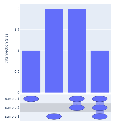
samples = [[1, 2, 3, 4], [2, 3, 4], [2, 5, 6]]
names = ["sample 1", "sample 2", "sample 3"]
usp = UpSetPlotly(samples=samples, sample_names=names)
usp.plot()
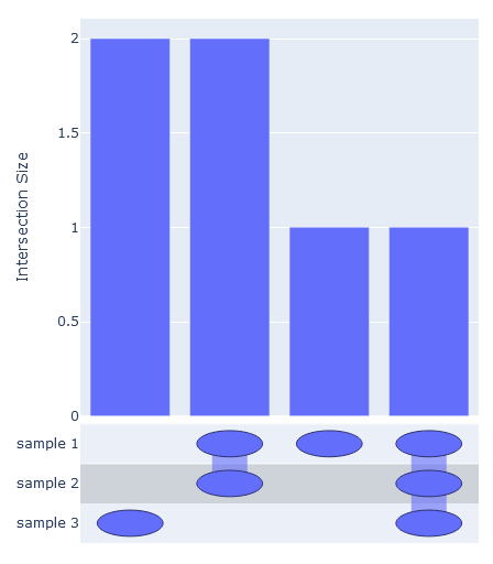
The intersections can be ordered by passing order_by={'increasing', 'decreasing'}
usp.plot(order_by='decreasing')
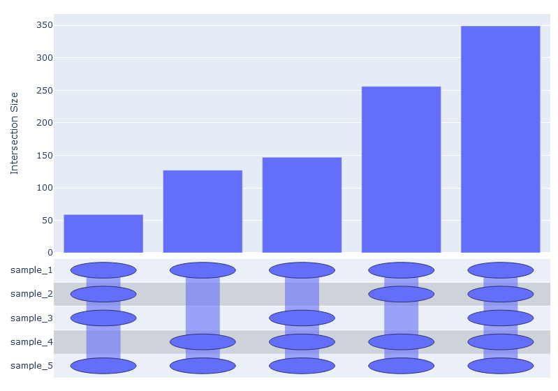
Larger sets are okay too.
import random

names = [f'sample_{i}' for i in range(1, 6)]
samples = [[''.join(random.choices('abcdefghijk', k=3)) for x in range(random.randint(1000, 3000))] for i in range(5)]

usp = UpSetPlotly(samples, names)
usp.plot()
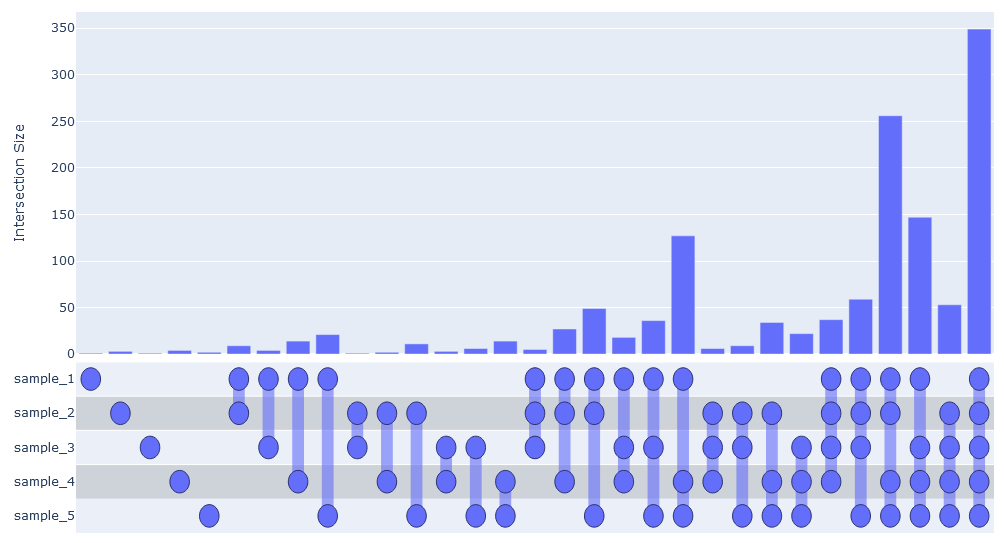
But there would soon be too many possible intersections to realistically visualize them all.
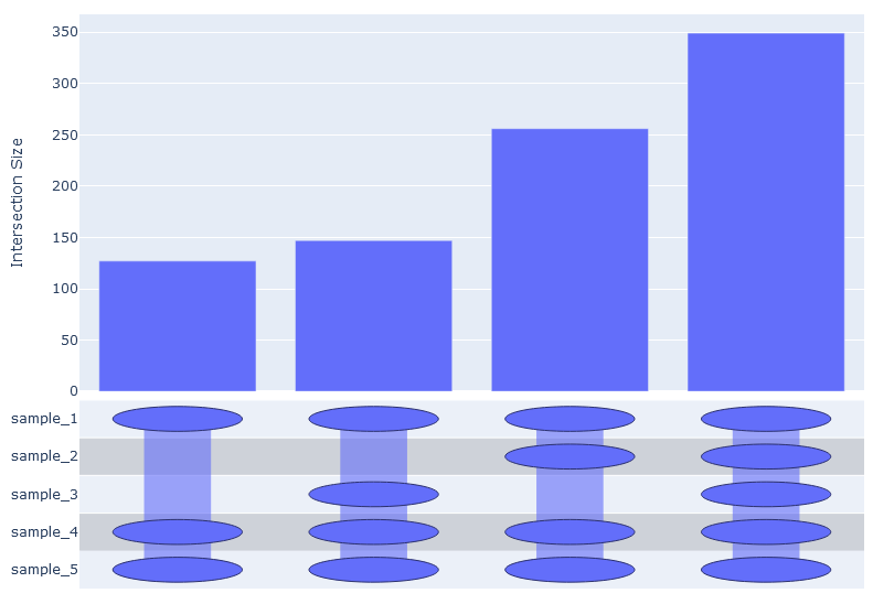
We can pass intersection_limit='by_total 0.05' to filter out any intersections which are smaller
that 5% of the total number of unique elements. Any float between 0 and 1 is acceptable.
usp.plot(order_by='increasing', intersection_limit='by_total 0.05')
Similarly, we can pass intersection_limit='by_sample 0.05 to filter out any intersections which
do not comprise at least 5% of any sample.
usp.plot(order_by='increasing', intersection_limit='by_sample 0.05')
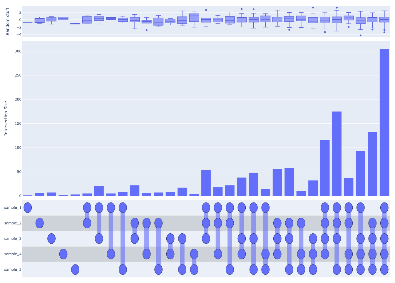
Additional data describing the elements can be passed to generate secondary plots above the UpSet plot.
all_elements = set()
all_elements.update(*[set(x) for x in samples])
additional_data = {element: random.normalvariate(0, 1) for element in all_elements}
usp.add_secondary_plot(data=additional_data, label='Random stuff', plot_type='box')
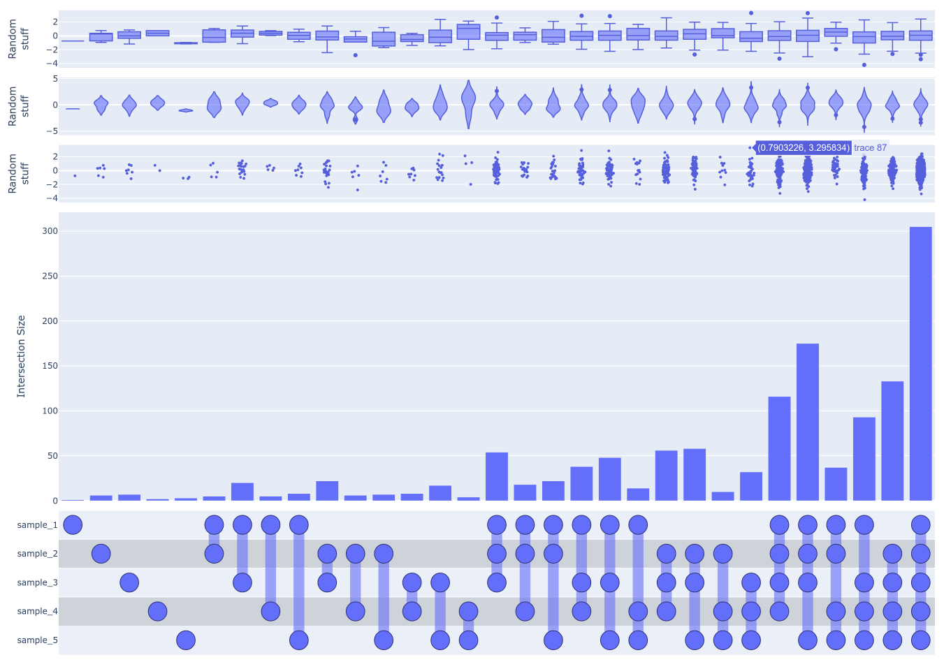
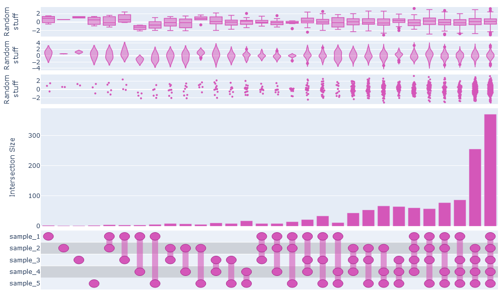
We can also do violin or swarm plots, or all three. Note that, annoyingly, we have to use html tags to create line breaks in the labels. This will keep them from colliding in this case.
usp = UpSetPlotly(samples, names)
usp.add_secondary_plot(data=additional_data, label='Random<br>stuff', plot_type='box')
usp.add_secondary_plot(data=additional_data, label='Random<br>stuff', plot_type='violin')
usp.add_secondary_plot(data=additional_data, label='Random<br>stuff', plot_type='swarm')
usp.plot()
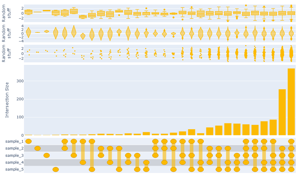
Finally, you can change the color scheme (a bit). By passing the color argument to
UpSetPlotly.plot, you set the base color for the image. Unfortunately you have to pass
in either HEX values or an RGB string (e.g. 'rgb(..., ..., ...)')
usp.plot(color='#fcba03')
usp.plot(color='rgb(212, 87, 185)')


Download files
Download the file for your platform. If you're not sure which to choose, learn more about installing packages.
Source Distribution
Built Distribution
Hashes for UpSetPlotly-0.1.7-py3-none-any.whl
| Algorithm | Hash digest | |
|---|---|---|
| SHA256 | 6c1b5b82ddbcc7be6c0c0a71cae569202bf37991d4379d102800d48afad66e35 |
|
| MD5 | 706ae5c22b8eb0a687b6c36ff96b2a01 |
|
| BLAKE2b-256 | 6351236d2bfeb2220679b4efaaeeb6f5081a2853ad5774dbd8f888c999ae4c86 |


