hiplot 0.1.33
pip install hiplot
Released:
High dimensional Interactive Plotting tool
Navigation

Unverified details
These details have not been verified by PyPIProject links
Meta
- Author: Facebook AI Research
- Requires: Python >=3.6
Project description
HiPlot - High dimensional Interactive Plotting 


HiPlot is a lightweight interactive visualization tool to help AI researchers discover correlations and patterns in high-dimensional data using parallel plots and other graphical ways to represent information.
Try a demo now with sweep data or upload your CSV or 
There are several modes to HiPlot:
- As a web-server (if your data is a CSV for instance)
- In a jupyter notebook (to visualize python data), or in Streamlit apps
- In CLI to render standalone HTML
pip install -U hiplot # Or for conda users: conda install -c conda-forge hiplot
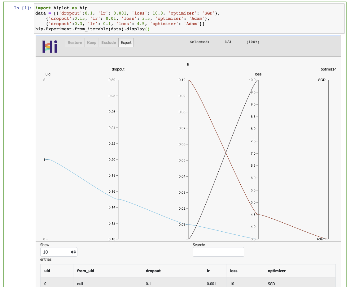
If you have a jupyter notebook, you can get started with something as simple as:
import hiplot as hip
data = [{'dropout':0.1, 'lr': 0.001, 'loss': 10.0, 'optimizer': 'SGD'},
        {'dropout':0.15, 'lr': 0.01, 'loss': 3.5, 'optimizer': 'Adam'},
        {'dropout':0.3, 'lr': 0.1, 'loss': 4.5, 'optimizer': 'Adam'}]
hip.Experiment.from_iterable(data).display()
See the live result
Links
- Blog post: https://ai.facebook.com/blog/hiplot-high-dimensional-interactive-plots-made-easy/
- Documentation: https://facebookresearch.github.io/hiplot/index.html
- Pypi package: https://pypi.org/project/hiplot/
- Conda package: https://anaconda.org/conda-forge/hiplot
- NPM package: https://www.npmjs.com/package/hiplot
- Examples: https://github.com/facebookresearch/hiplot/tree/main/examples
Citing
@misc{hiplot,
    author = {Haziza, D. and Rapin, J. and Synnaeve, G.},
    title = {{Hiplot, interactive high-dimensionality plots}},
    year = {2020},
    publisher = {GitHub},
    journal = {GitHub repository},
    howpublished = {\url{https://github.com/facebookresearch/hiplot}},
}
Credits
Inspired by and based on code from Kai Chang, Mike Bostock and Jason Davies.
External contributors (please add your name when you submit your first pull request):
License
Project details
Unverified details
These details have not been verified by PyPIProject links
Meta
- Author: Facebook AI Research
- Requires: Python >=3.6
Release history Release notifications | RSS feed


Download files
Download the file for your platform. If you're not sure which to choose, learn more about installing packages.
Source Distribution
Built Distribution
File details
Details for the file hiplot-0.1.33.tar.gz.
File metadata
- Download URL: hiplot-0.1.33.tar.gz
- Upload date:
- Size: 848.2 kB
- Tags: Source
- Uploaded using Trusted Publishing? No
- Uploaded via: twine/4.0.0 CPython/3.7.13
File hashes
| Algorithm | Hash digest | |
|---|---|---|
| SHA256 | f78a1bf52fac5dc8a59ac37454978f7343e7659ad8a419dec4c881539126ac9f |
|
| MD5 | a51f31f7a5e6f8521628c8718a594858 |
|
| BLAKE2b-256 | 81f05b17e48ebfcbd9f8014ee76949091e640929714c29937ea3a04fde9ac488 |
File details
Details for the file hiplot-0.1.33-py3-none-any.whl.
File metadata
- Download URL: hiplot-0.1.33-py3-none-any.whl
- Upload date:
- Size: 863.2 kB
- Tags: Python 3
- Uploaded using Trusted Publishing? No
- Uploaded via: twine/4.0.0 CPython/3.7.13
File hashes
| Algorithm | Hash digest | |
|---|---|---|
| SHA256 | 82761a0e087a04d696914f4e141197e9f6ae776a590369ec9db01e26710f9f85 |
|
| MD5 | 8a0e170b3a16f98b5b104ff03d9c7ce0 |
|
| BLAKE2b-256 | aea62f37a5fc35f9889c4ab09dea62ec0f9ae304789be1dc4965d231822a3e78 |


