Python Matplotlib, Numpy library to manage wind data, draw windrose (also known as a polar rose plot)


Project description


windrose
A windrose, also known as a polar rose plot, is a special diagram for representing the distribution of meteorological datas, typically wind speeds by class and direction. This is a simple module for the matplotlib python library, which requires numpy for internal computation.
Original code forked from: - windrose 1.4 by Lionel Roubeyrie lionel.roubeyrie@gmail.com http://youarealegend.blogspot.fr/search/label/windrose
Requirements:
matplotlib http://matplotlib.org/
numpy http://www.numpy.org/
and naturally python https://www.python.org/ :-P
Option libraries:
Pandas http://pandas.pydata.org/ (to feed plot functions easily)
Scipy http://www.scipy.org/ (to fit data with Weibull distribution)
ffmpeg https://www.ffmpeg.org/ (to output video)
click http://click.pocoo.org/ (for command line interface tools)
Install
A package is available and can be downloaded from PyPi and installed using:
$ pip install windrose
Notebook example :
An IPython (Jupyter) notebook showing this package usage is available at:
Script example :
This example use randoms values for wind speed and direction(ws and wd variables). In situation, these variables are loaded with reals values (1-D array), from a database or directly from a text file (see the “load” facility from the matplotlib.pylab interface for that).
from windrose import WindroseAxes
from matplotlib import pyplot as plt
import matplotlib.cm as cm
import numpy as np

#Create wind speed and direction variables

ws = np.random.random(500) * 6
wd = np.random.random(500) * 360
A stacked histogram with normed (displayed in percent) results :
ax = WindroseAxes.from_ax()
ax.bar(wd, ws, normed=True, opening=0.8, edgecolor='white')
ax.set_legend()
bar
Another stacked histogram representation, not normed, with bins limits
ax = WindroseAxes.from_ax()
ax.box(wd, ws, bins=np.arange(0, 8, 1))
ax.set_legend()
box
A windrose in filled representation, with a controled colormap
ax = WindroseAxes.from_ax()
ax.contourf(wd, ws, bins=np.arange(0, 8, 1), cmap=cm.hot)
ax.set_legend()
contourf
Same as above, but with contours over each filled region…
ax = WindroseAxes.from_ax()
ax.contourf(wd, ws, bins=np.arange(0, 8, 1), cmap=cm.hot)
ax.contour(wd, ws, bins=np.arange(0, 8, 1), colors='black')
ax.set_legend()
contourf-contour
###…or without filled regions
ax = WindroseAxes.from_ax()
ax.contour(wd, ws, bins=np.arange(0, 8, 1), cmap=cm.hot, lw=3)
ax.set_legend()
contour
After that, you can have a look at the computed values used to plot the windrose with the ax._info dictionnary : - ax._info['bins'] : list of bins (limits) used for wind speeds. If not set in the call, bins will be set to 6 parts between wind speed min and max. - ax._info['dir'] : list of directions “bundaries” used to compute the distribution by wind direction sector. This can be set by the nsector parameter (see below). - ax._info['table'] : the resulting table of the computation. It’s a 2D histogram, where each line represents a wind speed class, and each column represents a wind direction class.
So, to know the frequency of each wind direction, for all wind speeds, do:
ax.bar(wd, ws, normed=True, nsector=16)
table = ax._info['table']
wd_freq = np.sum(table, axis=0)
and to have a graphical representation of this result :
direction = ax._info['dir']
wd_freq = np.sum(table, axis=0)
plt.bar(np.arange(16), wd_freq, align='center')
xlabels = ('N','','N-E','','E','','S-E','','S','','S-O','','O','','N-O','')
xticks=arange(16)
gca().set_xticks(xticks)
draw()
gca().set_xticklabels(xlabels)
draw()
histo_WD
In addition of all the standard pyplot parameters, you can pass special parameters to control the windrose production. For the stacked histogram windrose, calling help(ax.bar) will give : bar(self, direction, var, **kwargs) method of windrose.WindroseAxes instance Plot a windrose in bar mode. For each var bins and for each sector, a colored bar will be draw on the axes.
Mandatory: - direction : 1D array - directions the wind blows from, North centred - var : 1D array - values of the variable to compute. Typically the wind speeds
Optional: - nsector : integer - number of sectors used to compute the windrose table. If not set, nsectors=16, then each sector will be 360/16=22.5°, and the resulting computed table will be aligned with the cardinals points. - bins : 1D array or integer- number of bins, or a sequence of bins variable. If not set, bins=6 between min(var) and max(var). - blowto : bool. If True, the windrose will be pi rotated, to show where the wind blow to (usefull for pollutant rose). - colors : string or tuple - one string color ('k' or 'black'), in this case all bins will be plotted in this color; a tuple of matplotlib color args (string, float, rgb, etc), different levels will be plotted in different colors in the order specified. - cmap : a cm Colormap instance from matplotlib.cm. - if cmap == None and colors == None, a default Colormap is used. - edgecolor : string - The string color each edge bar will be plotted. Default : no edgecolor - opening : float - between 0.0 and 1.0, to control the space between each sector (1.0 for no space)
probability density function (pdf) and fitting Weibull distribution
A probability density function can be plot using:
from windrose import WindAxes
ax = WindAxes.from_ax()
bins = np.arange(0, 6 + 1, 0.5)
bins = bins[1:]
ax, params = ax.pdf(ws, bins=bins)
Optimal parameters of Weibull distribution can be displayed using
print(params)
(1, 1.7042156870194352, 0, 7.0907180300605459)
Functional API
Instead of using object oriented approach like previously shown, some “shortcut” functions have been defined: wrbox, wrbar, wrcontour, wrcontourf, wrpdf. See unit tests.
Pandas support
windrose not only supports Numpy arrays. It also supports also Pandas DataFrame. plot_windrose function provides most of plotting features previously shown.
from windrose import plot_windrose
N = 500
ws = np.random.random(N) * 6
wd = np.random.random(N) * 360
df = pd.DataFrame({'speed': ws, 'direction': wd})
plot_windrose(df, kind='contour', bins=np.arange(0.01,8,1), cmap=cm.hot, lw=3)
Mandatory: - df: Pandas DataFrame with DateTimeIndex as index and at least 2 columns ('speed' and 'direction').
Optional: - kind : kind of plot (might be either, 'contour', 'contourf', 'bar', 'box', 'pdf') - var_name : name of var column name ; default value is VAR_DEFAULT='speed' - direction_name : name of direction column name ; default value is DIR_DEFAULT='direction' - clean_flag : cleanup data flag (remove data points with NaN, var=0) before plotting ; default value is True.
Video export
A video of plots can be exported. See:
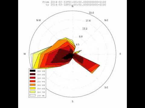
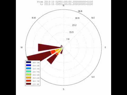
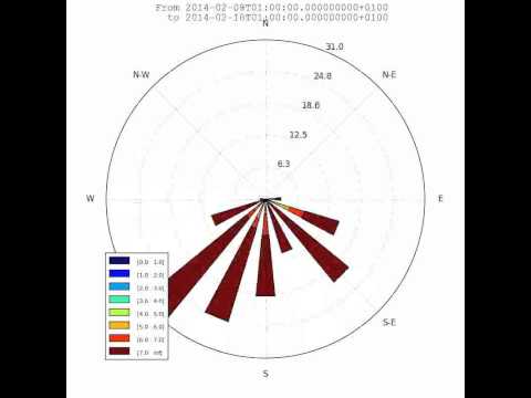
This is just a sample for now. API for video need to be created.
Use:
$ python samples/example_animate.py --help
to display command line interface usage.
Development
You can help to develop this library.
Issues
You can submit issues using https://github.com/scls19fr/windrose/issues
Clone
You can clone repository to try to fix issues yourself using:
$ git clone https://github.com/scls19fr/windrose.git
Run unit tests
Run all unit tests
$ nosetests -s -v
Run a given test
$ nosetests tests.test_windrose:test_plot_by -s -v
Install development version
$ python setup.py install
or
$ sudo pip install git+https://github.com/scls19fr/windrose.git
Collaborating
Fork repository
Create a branch which fix a given issue
Submit pull requests
Release history Release notifications | RSS feed


Download files
Download the file for your platform. If you're not sure which to choose, learn more about installing packages.
Source Distribution
Built Distribution
Hashes for windrose-1.6-py2.py3-none-any.whl
| Algorithm | Hash digest | |
|---|---|---|
| SHA256 | 987adb2e4c818e64ad860598f32ea1be1106d6c93e4df20f7f098d22a63d31f9 |
|
| MD5 | 555a548c56fab91a21c5704de1c67da1 |
|
| BLAKE2b-256 | a84085481dfd902eeb57d57f9f498ab33827953f88d866b4fe0b6e2ae191fd56 |


