A simple to understand, easy to use, HIGHLY customizable GUI for Python. Based solely on tkinter. Make your own GUIs. Runs on Raspberry Pi too.


Project description

PySimpleGUI
(Ver 2.7)
Super-simple GUI to grasp... Powerfully customizable.
Note - Python3 is required to run PySimpleGUI. It takes advantage of some Python3 features that do not translate well into Python2.
Looking to take your Python code from the world of command lines and into the convenience of a GUI? Have a Raspberry Pi with a touchscreen that's going to waste because you don't have the time to learn a GUI SDK? Look no further, you've found your GUI package.
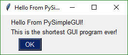
import PySimpleGUI as sg

sg.MsgBox('Hello From PySimpleGUI!', 'This is the shortest GUI program ever!')
Build beautiful customized forms that fit your specific problem. Let PySimpleGUI solve your GUI problem while you solve the real problems. Do you really want to plod through the mountains of code required to program tkinter?
Perhaps you're looking for a way to interact with your Raspberry Pi in a more friendly way. The is the same form as above, except shown on a Pi.
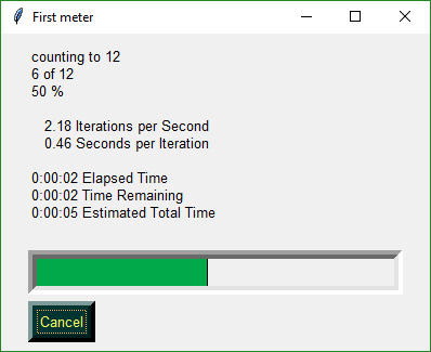
In addition to a primary GUI, you can add a Progress Meter to your code with ONE LINE of code. Slide this into any of your for loops and get a nice meter like this:
EasyProgressMeter('My meter title', current_value, max value)
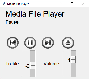
You can build an async media player GUI with custom buttons in 30 lines of code.
I was frustrated by having to deal with the dos prompt when I had a powerful Windows machine right in front of me. Why is it SO difficult to do even the simplest of input/output to a window in Python??
There are a number of 'easy to use' Python GUIs, but they're very limiting. PySimpleGUI takes the best of packages like EasyGUIand WxSimpleGUI , both really handy but limited. The primary difference between these and PySimpleGUI is that in addition to getting the simple Message Boxes you also get the ability to make your own forms that are highly customizeable. Don't like the standard Message Box? Then make your own!
Every call has optional parameters so that you can change the look and feel. Don't like the button color? It's easy to change by adding a button_color parameter to your widget.
GUI Packages with more functionality, like QT and WxPython, require configuring and can take a week to get reasonably familiar with the interfaces. Clearly there needs to be a middle ground between forms with 1 or two input fields and a full-blown GUI. You'll be making your own custom forms with PySimpleGUI within minutes, even Async forms.
With a simple GUI, it becomes practical to "associate" .py files with the python interpreter on Windows. Double click a py file and up pops a GUI window, a more pleasant experience than opening a dos Window and typing a command line.
The PySimpleGUI package is focused on the developer. How can the desired result be achieved in as little and as simple code as possible? This was the mantra used to create PySimpleGUI. How can it be done is a Python-like way?
Features of PySimpleGUI include:
    Text
    Single Line Input
    Buttons including these types:
        File Browse
        Folder Browse
        Non-closing return
        Close form
        Realtime
    Checkboxes
    Radio Buttons
    Listbox
    Slider
    Icons
    Multi-line Text Input
    Scroll-able Output
    Images
    Progress Bar
    Async/Non-Blocking Windows
    Tabbed forms
    Persistent Windows
    Redirect Python Output/Errors to scrolling window
    'Higher level' APIs (e.g. MessageBox, YesNobox, ...)
    Single-Line-Of-Coide Proress Bar & Debug Print
    Complete control of colors, look and feel
    Button images
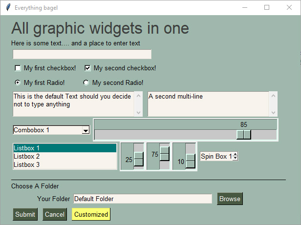
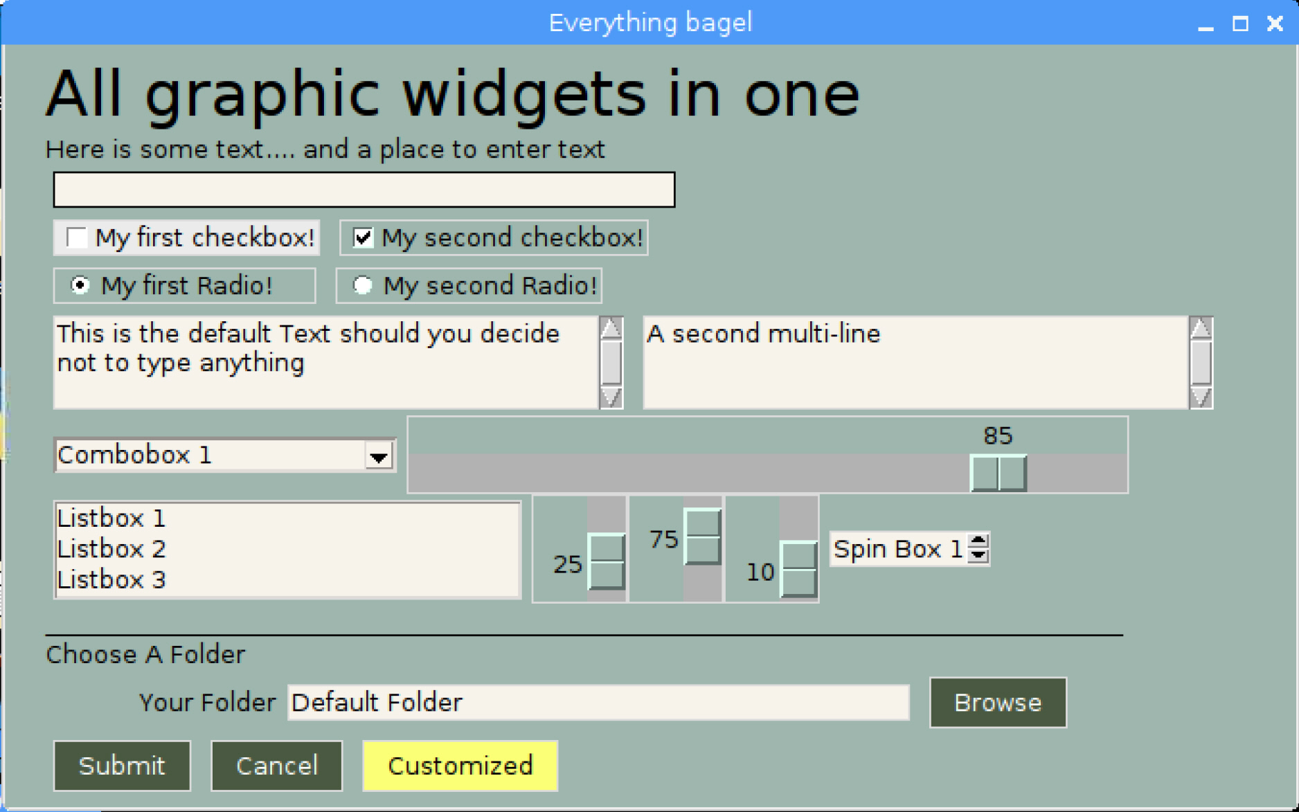
An example of many widgets used on a single form. A little further down you'll find the TWENTY lines of code required to create this complex form. Try it if you don't believe it. Start Python, copy and paste the code below into the >>> prompt and hit enter. This will pop up...
Here is the code that produced the above screenshot.
import PySimpleGUI as SG

with SG.FlexForm('Everything bagel', auto_size_text=True, default_element_size=(40, 1)) as form:
    layout = [
        [SG.Text('All graphic widgets in one form!', size=(30, 1), font=("Helvetica", 25), text_color='blue')],
        [SG.Text('Here is some text.... and a place to enter text')],
        [SG.InputText()],
        [SG.Checkbox('My first checkbox!'), SG.Checkbox('My second checkbox!', default=True)],
        [SG.Radio('My first Radio!     ', "RADIO1", default=True), SG.Radio('My second Radio!', "RADIO1")],
        [SG.Multiline(default_text='This is the default Text shoulsd you decide not to type anything',
                      scale=(2, 10))],
        [SG.InputCombo(['Combobox 1', 'Combobox 2'], size=(20, 3)),
         SG.Slider(range=(1, 100), orientation='h', size=(35, 20), default_value=85)],
        [SG.Listbox(values=['Listbox 1', 'Listbox 2', 'Listbox 3'], size=(30, 6)),
         SG.Slider(range=(1, 100), orientation='v', size=(10, 20), default_value=25),
         SG.Slider(range=(1, 100), orientation='v', size=(10, 20), default_value=75),
         SG.Slider(range=(1, 100), orientation='v', size=(10, 20), default_value=10)],
        [SG.Text('_'  * 100, size=(70, 1))],
        [SG.Text('Choose Source and Destination Folders', size=(35, 1))],
        [SG.Text('Source Folder', size=(15, 1), auto_size_text=False, justification='right'), SG.InputText('Source'), SG.FolderBrowse()],
        [SG.Text('Destination Folder', size=(15, 1), auto_size_text=False, justification='right'), SG.InputText('Dest'),
         SG.FolderBrowse()],
        [SG.Submit(), SG.Cancel(), SG.SimpleButton('Customized', button_color=('white', 'green'))]
         ]

button, values = form.LayoutAndRead(layout)
A note on screen shots You will see a number of different styles of buttons, data entry fields, etc, in this readme. They were all made with the same SDK, the only difference is in the settings that are specified on a per-element, row, form, or global basis. One setting in particular, border_width, can make a big difference on the look of the form. Some of the screenshots had a border_width of 6, others a value of 1.
Design Goals
Copy, Paste, Run.
PySimpleGUI's goal with the API is to be easy on the programmer, and to function in a Python-like way. Since GUIs are visual, it was desirable for the SDK to visually match what's on the screen.
Be Pythonic
Be Pythonic... Attempted to use language constructs in a natural way and to exploit some of Python's interesting features. Python's lists and optional parameters make PySimpleGUI work.
-
Forms are represented as Python lists.
- A form is a list of rows
- A row is a list of elements
-
Return values are a list of button presses and input values.
Getting Started with PySimpleGUI
Installing
pip install PySimpleGUI
or Simply download the file - PySimpleGUI.py and import it into your code
Prerequisites
Python 3 tkinter
Should run on all Python platforms that have tkinter running on them. Has been thoroughly tested on Windows. While not tested elsewhere, should work on Linux, Mac, Pi, etc.
Using
To use in your code, simply import....
import PySimpleGUI as SG
Then use either "high level" API calls or build your own forms.
SG.MsgBox('This is my first message box')
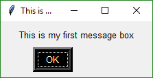
Yes, it's just that easy to have a window appear on the screen using Python. With PySimpleGUI, making a custom form appear isn't much more difficult. The goal is to get you running on your GUI within minutes, not hours nor days.
APIs
PySimpleGUI can be broken down into 2 types of API's:
- High Level single call functions
- Custom form functions
Python Language Features
There are a couple of Python language features that PySimpleGUI utilizes heavily that should be understood first...
- Variable number of arguments to a function call
- Optional parameters to a function call
Variable Number of Arguments
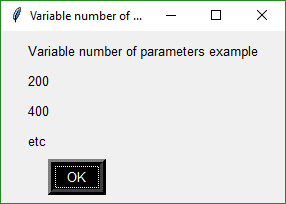
The "High Level" API calls that output values take a variable number of arguments so that they match a "print" statement as much as possible. The idea is to make it simple for the programmer to output as many items as desired and in any format. The user need not convert the variables to be output into the strings. The PySimpleGUI functions do that for the user.
SG.MsgBox('Variable number of parameters example', var1, var2, "etc")
Each new item begins on a new line in the Message Box
Optional Parameters to a Function Call
This feature of the Python language is utilized heavily as a method of customizing forms and form Elements. Rather than requiring the programmer to specify every possible option for a widget, instead only the options the caller wants to override are specified.
Here is the function definition for the MsgBox function. The details aren't important. What is important is seeing that there is a long list of potential tweaks that a caller can make. However, they don't have to be specified on each and every call.
def MsgBox(*args,
           button_color=None,
           button_type=MSG_BOX_OK,
           auto_close=False,
           auto_close_duration=None,
           icon=DEFAULT_WINDOW_ICON,
           line_width=MESSAGE_BOX_LINE_WIDTH,
           font=None):
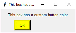
If the caller wanted to change the button color to be black on yellow, the call would look something like this:
SG.MsgBox('This box has a custom button color',
          button_color=('black', 'yellow'))
High Level API Calls
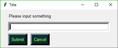
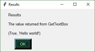
The classic "input a value, print result" example. Often command line programs simply take some value as input on the command line, do something with it and then display the results. Moving from the command line to a GUI is very simple. This code prompts user to input a line of text and then displays that text in a messages box:
import PySimpleGUI_local as SG

rc = SG.GetTextBox('Title', 'Please input something')
SG.MsgBox('Results', 'The value returned from GetTextBox', rc)
Message Boxes
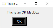
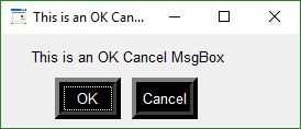
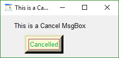
In addition to MsgBox, you'll find a several API calls that are shortcuts to common messages boxes. You can achieve similar results by calling MsgBox with the correct parameters.
The differences tend to be the number and types of buttons. Here are the calls and the windows that are created.
import PySimpleGUI as SG
SG.MsgBoxOK('This is an OK MsgBox')
SG.MsgBoxOKCancel('This is an OK Cancel MsgBox')
SG.MsgBoxCancel('This is a Cancel MsgBox')
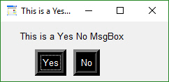
SG.MsgBoxYesNo('This is a Yes No MsgBox')
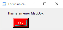
SG.MsgBoxError('This is an error MsgBox')
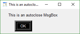
SG.MsgBoxAutoClose('This is an autoclose MsgBox')
SG.ScrolledTextBox(my_text, height=10)
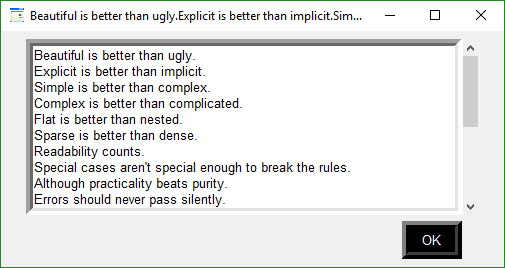
Take a moment to look at that last one. It's such a simple API call and yet the result is awesome. Rather than seeing text scrolling past on your display, you can capture that text and present it in a scrolled interface. It's handy enough of an API call that it can also be called using the name sprint which is easier to remember than ScrollectTextBox. Your code could contain a line like:
sprint(f'My variables values include x={x}', f'y={y}')
This becomes a debug print of sorts that will route to a scrolled window.
High Level User Input
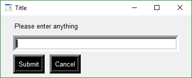
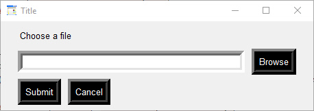
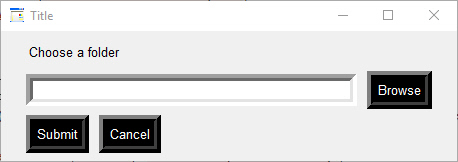
There are 3 very basic user input high-level function calls. It's expected that for most applications, a custom input form will be created. If you need only 1 value, then perhaps one of these high level functions will work.
- GetTextBox
- GetFileBox
- GetFolderBox
submit_clicked, value = SG.GetTextBox('Title', 'Please enter anything')
submit_clicked, value = SG.GetFileBox('Title', 'Choose a file')
submit_clicked, value = SG.GetPathBox('Title', 'Choose a folder')
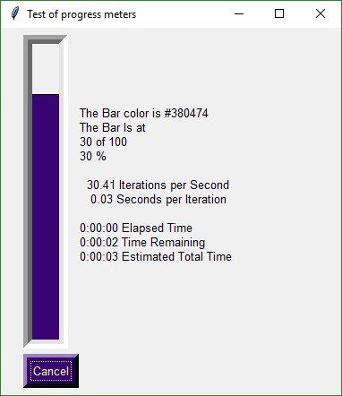
Progress Meter!
We all have loops in our code. 'Isn't it joyful waiting, watching a counter scrolling past in a text window? How about one line of code to get a progress meter, that contains statistics about your code?
EasyProgressMeter(title,
                  current_value,
                  max_value,
                  *args,
                  orientation=None,
                  bar_color=DEFAULT_PROGRESS_BAR_COLOR,
                  button_color=None,
                  size=DEFAULT_PROGRESS_BAR_SIZE,
                  scale=(None, None),
                  border_width=DEFAULT_PROGRESS_BAR_BORDER_WIDTH):
Here's the one-line Progress Meter in action!
for i in range(1,10000):
    SG.EasyProgressMeter('My Meter', i+1, 10000, 'Optional message')
That line of code resulted in this window popping up and updating.
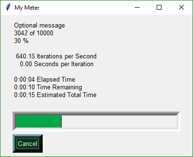
A meter AND fun statistics to watch while your machine grinds away, all for the price of 1 line of code.
With a little trickery you can provide a way to break out of your loop using the Progress Meter form. The cancel button results in a False return value from EasyProgressMeter. It normally returns True.
if not SG.EasyProgressMeter('My Meter', i+1, 10000, 'Optional message'):
   break
Be sure and add one to your loop counter so that your counter goes from 1 to the max value. If you do not add one, your counter will never hit the max value. Instead it will go from 0 to max-1.
Debug Output
Another call in the 'Easy' families of APIs is EasyPrint. It will output to a debug window. If the debug window isn't open, then the first call will open it. No need to do anything but stick a 'print' call in your code. You can even replace your 'print' calls with calls to EasyPrint by simply sticking the statement
print = SG.EasyPrint
at the top of your code.
There are a number of names for the same EasyPrint function. Print is one of the better ones to use as it's easy to remember. It is simply print with a capital P.
import PySimpleGUI as SG

for i in range(100):
    SG.Print(i)
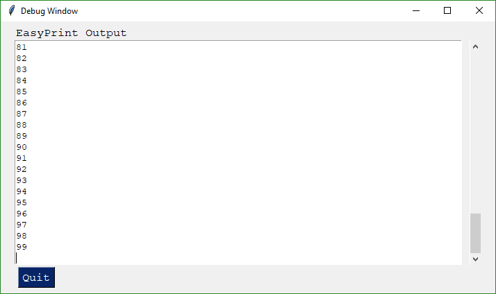
import PySimpleGUI as SG

print=SG.Print
for i in range(100):
    print(i)
Just like the standard print call, EasyPrint supports the sep and end keyword arguments. Other names that can be used to call EasyPrint include Print, eprint, If you want to close the window, call the function EasyPrintClose.
A word of caution. There are known problems when multiple PySimpleGUI windows are opened, particularly if the user closes them in an unusual way. Not a reason to stay away from using it. Just something to keep in mind if you encounter a problem.
You can change the size of the debug window using the SetOptions call with the debug_win_size parameter.
Custom Form API Calls (Your First Form)
This is the FUN part of the programming of this GUI. In order to really get the most out of the API, you should be using an IDE that supports auto complete or will show you the definition of the function. This will make customizing go smoother.
This first section on custom forms is for your typical, blocking, non-persistant form. By this I mean, when you "show" the form, the function will not return until the user has clicked a button or closed the window. When this happens, the form's window will be automatically closed.
Two other types of forms exist.
- Persistent form - rather than closing on button clicks, the show form function returns and the form continues to be visible. This is good for applications like a chat window.
- Asynchronous form - the trickiest of the lot. Great care must be exercised. Examples are an MP3 player or status dashboard. Async forms are updated (refreshed) on a periodic basis.
It's both not enjoyable nor helpful to immediately jump into tweaking each and every little thing available to you. Let's start with a basic Browse for a file and do something with it.
Copy these design patterns!
Pattern 1 - With Context Manager
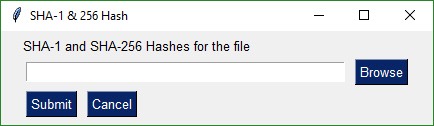
with sg.FlexForm('SHA-1 & 256 Hash', auto_size_text=True) as form:
    form_rows = [[sg.Text('SHA-1 and SHA-256 Hashes for the file')],
                 [sg.InputText(), sg.FileBrowse()],
                 [sg.Submit(), sg.Cancel()]]
    button, (source_filename,) = form.LayoutAndRead(form_rows)
Pattern 2 - No Context Manager
form = sg.FlexForm('SHA-1 & 256 Hash', auto_size_text=True)
form_rows = [[sg.Text('SHA-1 and SHA-256 Hashes for the file')],
             [sg.InputText(), sg.FileBrowse()],
             [sg.Submit(), sg.Cancel()]]
button, (source_filename,) = form.LayoutAndRead(form_rows)
These 2 design patters both produce this custom form:
It's important to use the "with" context manager so that resources are freed as quickly as possible, using the currently executing thread. PySimpleGUI uses tkinter. tkinter is very picky about who releases objects and when. The with takes care of disposing of everything properly for you.
The second design pattern is not context manager based. If you are struggling with an unknown error, try modifying the code to run without a context manager. To do so, you simple remove the with, stick the form on the front of that statement, and un-indent the with-block code.
You will use these design patterns or code templates for all of your "normal" (blocking) types of input forms. Copy it and modify it to suit your needs. This is the quickest way to get your code up and running with PySimpleGUI. This is the most basic / normal of the design patterns.
How GUI Programming in Python Should Look
GUI programming in Python is a mess. tkinter kinda sucks. Why is Python such a great teaching language and yet no GUI framework exists that lends itself to the basic building blocks of Python, the list?
The key to custom forms in PySimpleGUI is to view forms as ROWS of Widgets (Elements). Each row is specified as a list of these widgets. Put the rows together and you've got a form.
Let's look at this one.
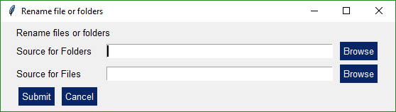
Let's agree the form has 4 rows.
The first row only has text that reads Rename files or folders
The second row has 3 elements in it. First the text Source for Folders, then an input field, then a browse button.
Now let's look at how those 2 rows and the other two row from Python code:
layout = [[sg.Text('Rename files or folders')],
          [sg.Text('Source for Folders', size=(15, 1)), sg.InputText(), sg.FolderBrowse()],
          [sg.Text('Source for Files ', size=(15, 1)), sg.InputText(), sg.FolderBrowse()],
          [sg.Submit(), sg.Cancel()]]
See how the source code mirrors the layout? You simply make lists for each row, then submit that table to PySimpleGUI to show and get values from.
And what about those return values? Most people simply want to show a form, get the input values and do something with them. So why break up the code into button callbacks, etc, when I simply want my form's input values to be given to me.
The same "row" concept applies to return values. The form is scanned from top to bottom, left to right. Each field that's an input field will occupy a spot in the return values.
In our example form, there are 2 fields, so the return values from this form will be a list with 2 values in it.
button, (folder_path, file_path) = form.LayoutAndRead(layout)
In the statement that shows and reads the form, the two input fields are directly assigned to the caller's variables folder_path and file_path, ready to use. No parsing no callbacks.
Isn't this what almost every Python programmer looking for a GUI wants?? Something easy to work with to get the values and move on to the rest of the program, where the real action is taking place. Why write pages of tkinter code when the same layout can be achieved with PySimpleGUI in 3 or 4 lines of code. 4 lines or 40? I chose 4.
Laying out your form
Your form is a 2 dimensional list in Python. The first dimension are rows, the second is a list of Elements for each row. The first thing you want to do is layout your form on paper.
layout = [ [row 1],
           [row 2],
           [row 3] ]
Simple enough... a list of lists. A row is a list of Elements. For example this could be a row with a couple of elements on it.
[ Input, Button]
Turning back to our example. This GUI roughly looks like this:
layout = [ [Text],
           [InputText, FileBrowse]
           [Submit, Cancel] ]
Now let's put it all together into an entire program.
Line by line explanation
Going through each line of code in the above form will help explain how to use this design patter. Copy, modify and run it!
with SG.FlexForm('SHA-1 & 256 Hash', auto_size_text=True) as form:
This creates a new form, storing it in the variable form.
form_rows = [[SG.Text('SHA-1 and SHA-256 Hashes for the file')],
The next few rows of code lay out the rows of elements in the window to be displayed. The variable form_rows holds our entire GUI window. The first row of this form has a Text element. These simply display text on the form.
[SG.InputText(), SG.FileBrowse()],
Now we're on the second row of the form. On this row there are 2 elements. The first is an Input field. It's a place the user can enter strings. The second element is a File Browse Button. A file or folder browse button will always fill in the text field to it's left unless otherwise specified. In this example, the File Browse Button will interact with the InputText field to its left.
[SG.Submit(), SG.Cancel()]]
The last line of the form_rows variable assignment contains a Submit and a Cancel Button. These are buttons that will cause a form to return its value to the caller.
button, (source_filename, ) = form.LayoutAndRead(form_rows)
This is the code that displays the form, collects the information and returns the data collected. In this example we have a button return code and only 1 input field. The result of the form is stored directly into the variable we wish to work with.
Return values
Return information from FlexForm, SG's primary form builder interface, is in this format:
button, (value1, value2, ...)
Each of the Elements that are Input Elements will have a value in the list of return values. You can unpack your GUI directly into the variables you want to use.
button, (filename, folder1, folder2, should_overwrite) = form.LayoutAndRead(form_rows)
Or, you can unpack the return results separately.
button, values = form.LayoutAndRead(form_rows)
filename, folder1, folder2, should_overwrite = values
If you have a SINGLE value being returned, it is written this way:
button, (value1,) = form.LayoutAndRead(form_rows)
Another way of parsing the return values is to store the list of values into a variable representing the list of values.
 button, value_list = form.LayoutAndRead(form_rows)
 value1 = value_list[0]
 value2 = value_list[1]
 ...
All Widgets / Elements
This code utilizes as many of the elements in one form as possible.
 with SG.FlexForm('Everything bagel', auto_size_text=True, default_element_size=(40, 1)) as form:
    layout = [
        [SG.Text('All graphic widgets in one form!', size=(30, 1), font=("Helvetica", 25), text_color='blue')],
        [SG.Text('Here is some text.... and a place to enter text')],
        [SG.InputText()],
        [SG.Checkbox('My first checkbox!'), SG.Checkbox('My second checkbox!', default=True)],
        [SG.Radio('My first Radio!     ', "RADIO1", default=True), SG.Radio('My second Radio!', "RADIO1")],
        [SG.Multiline(default_text='This is the default Text shoulsd you decide not to type anything',
                      scale=(2, 10))],
        [SG.InputCombo(['Combobox 1', 'Combobox 2'], size=(20, 3)),
         SG.Slider(range=(1, 100), orientation='h', size=(35, 20), default_value=85)],
        [SG.Listbox(values=['Listbox 1', 'Listbox 2', 'Listbox 3'], size=(30, 6)),
         SG.Slider(range=(1, 100), orientation='v', size=(10, 20), default_value=25),
         SG.Slider(range=(1, 100), orientation='v', size=(10, 20), default_value=75),
         SG.Slider(range=(1, 100), orientation='v', size=(10, 20), default_value=10)],
        [SG.Text('_'  * 100, size=(70, 1))],
        [SG.Text('Choose Source and Destination Folders', size=(35, 1))],
        [SG.Text('Source Folder', size=(15, 1), auto_size_text=False, justification='right'), SG.InputText('Source'), SG.FolderBrowse()],
        [SG.Text('Destination Folder', size=(15, 1), auto_size_text=False, justification='right'), SG.InputText('Dest'),
         SG.FolderBrowse()],
        [SG.Submit(), SG.Cancel(), SG.SimpleButton('Customized', button_color=('white', 'green'))]
         ]

     button, values = form.LayoutAndRead(layout)
This is a somewhat complex form with quite a bit of custom sizing to make things line up well. This is code you only have to write once. When looking at the code, remember that what you're seeing is a list of lists. Each row contains a list of Graphical Elements that are used to create the form.
Clicking the Submit button caused the form call to return. The call to MsgBox resulted in this dialog box.
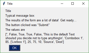
Note, button value can be None. The value for button will be the text that is displayed on the button element when it was created. If the user closed the form using something other than a button, then button will be None.
You can see in the MsgBox that the values returned are a list. Each input field in the form generates one item in the return values list. All input fields return a string except for Check Boxes and Radio Buttons. These return bool.
Building Custom Forms
You will find it much easier to write code using PySimpleGUI if you use an IDE such as PyCharm. The features that show you documentation about the API call you are making will help you determine which settings you want to change, if any. In PyCharm, two commands are particularly helpful.
Control-Q (when cursor is on function name) brings up a box with the function definition
Control-P (when cursor inside function call "()") shows a list of parameters and their default values
Synchronous Forms
The most common use of PySimpleGUI is to display and collect information from the user. The most straightforward way to do this is using a "blocking" GUI call. Execution is "blocked" while waiting for the user to close the GUI form/dialog box.
You've already seen a number of examples above that use blocking forms. Anytime you see a context manager used (see the with statement) it's most likely a blocking form. You can examine the show calls to be sure. If the form is a non-blocking form, it must indicate that in the call to form.show.
NON-BLOCKING form call:
form.Show(non_blocking=True)
Beginning a Form
The first step is to create the form object using the desired form customization.
with FlexForm('Everything bagel', auto_size_text=True, default_element_size=(30,1)) as form:
This is the definition of the FlexForm object:
def FlexForm(title,
    default_element_size=(DEFAULT_ELEMENT_SIZE[0], DEFAULT_ELEMENT_SIZE[1]),
    auto_size_text=None,
    auto_size_buttons=None,
    scale=(None, None),
    location=(None, None),
    button_color=None,Font=None,
    progress_bar_color=(None,None),
    is_tabbed_form=False,
    border_depth=None,
    auto_close=False,
    auto_close_duration=DEFAULT_AUTOCLOSE_TIME,
    icon=DEFAULT_WINDOW_ICON):
Parameter Descriptions. You will find these same parameters specified for each Element and some of them in Row specifications. The Element specified value will take precedence over the Row and Form values.
   default_element_size - Size of elements in form in characters (width, height)
   auto_size_text - Bool. True if elements should size themselves according to contents
   auto_size_buttons - Bool. True if button elements should size themselves according to their text label
   scale - Set size of element to be a multiple of the Element size
   location - Location to place window in pixels
   button_color - Default color for buttons (foreground, background). Can be text or hex
   progress_bar_color - Foreground and background colors for progress bars
   is_tabbed_form - Bool. If True then form is a tabbed form
   border_depth - Amount of 'bezel' to put on input boxes, buttons, etc.
   auto_close - Bool.  If True form will autoclose
   auto_close_duration - Duration in seconds before form closes
   icon - .ICO file that will appear on the Task Bar and end of Title Bar
Sizes
Note several variables that deal with "size". Element sizes are measured in characters. A Text Element with a size of 20,1 has a size of 20 characters wide by 1 character tall.
The default Element size for PySimpleGUI is (45,1).
Sizes can be set at the element level, or in this case, the size variables apply to all elements in the form. Setting size=(20,1) in the form creation call will set all elements in the form to that size.
In addition to size there is a scale option. scale will take the Element's size and scale it up or down depending on the scale value. scale=(1,1) doesn't change the Element's size. scale=(2,1) will set the Element's size to be twice as wide as the size setting.
There are a couple of widgets where one of the size values is in pixels rather than characters. This is true for Progress Meters and Sliders. The second parameter is the 'height' in pixels.
FlexForm - form-level variables overview
A summary of the variables that can be changed when a FlexForm is created
     default_element_size - set default size for all elements in the form
     auto_size_text- true/false autosizing turned on / off
     scale - set scale value for all elements
     button_color- default button color (foreground, background)
     font - font name and size for all text items
     progress_bar_color - progress bar colors
     is_tabbed_form - true/false indicates form is a tabbed or normal form
     border_depth - style setting for buttons, input fields
     auto_close - true/false indicates if form will automatically close
     auto_close_duration - how long in seconds before closing form
     icon - filename for icon that's displayed on the window on taskbar
Elements
"Elements" are the building blocks used to create forms. Some GUI APIs use the term Widget to describe these graphic elements.
 Text
 Single Line Input
 Buttons including these types:
     File Browse
     Folder Browse
     Non-closing return
     Close form
     Realtime
 Checkboxes
 Radio Buttons
 Listbox
 Slider
 Multi-line Text Input
 Scroll-able Output
 Progress Bar
 Async/Non-Blocking Windows
 Tabbed forms
 Persistent Windows
 Redirect Python Output/Errors to scrolling Window
 "Higher level" APIs (e.g. MessageBox, YesNobox, ...)
Output Elements
Building a form is simply making lists of Elements. Each list is a row in the overall GUI dialog box. The definition looks something like this:
layout = [ [row 1 element, row 1 element],
           [row 2 element, row 2 element, row 2 element] ]
The code is a crude representation of the GUI, laid out in text.
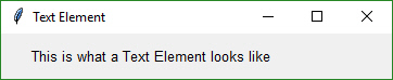
Text Element
layout = [[SG.Text('This is what a Text Element looks like')]]
The most basic element is the Text element. It simply displays text. Many of the 'options' that can be set for a Text element are shared by other elements. Size, Scale are a couple that you will see in every element.
Text(Text,
    scale=(None, None),
    size=(None, None),
    auto_size_text=None,
    font=None,
    text_color=None,
    justification=None)
.
Text - The text that's displayed
size - Element's size
auto_size_text - Bool. Change width to match size of text
font - Font name and size to use
text_color - text color
justification - Justification for the text. String - 'left', 'right', 'center'
Some commonly used elements have 'shorthand' versions of the functions to make the code more compact. The functions T and Txt are the same as calling Text.
Fonts in PySimpleGUI are always in this format:
(font_name, point_size)
The default font setting is
("Helvetica", 10)
Color in PySimpleGUI are always in this format:
(foreground, background)
The values foreground and background can be the color names or the hex value formatted as a string:
"#RRGGBB"
auto_size_text
A True value for auto_size_text, when placed on any Element, indicates that the width of the Element should be shrunk do the width of the text. This is particularly useful with Buttons as fixed-width buttons are somewhat crude looking. The default value is False. You will often see this setting on FlexForm definitions.
Shorthand functions
The shorthand functions for Text are Txt and T
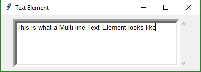
Multiline Text Element
layout = [[SG.Multiline('This is what a Multi-line Text Element looks like', size=(45,5))]]
DefaultText optional parameter is used to indicate what to output to the window.
Multiline(default_text='',
       enter_submits = False,
       scale=(None, None),
          size=(None, None),
        auto_size_text=None)
.
default_text - Text to display in the text box
enter_submits - Bool. If True, pressing Enter key submits form
scale - Element's scale
size - Element's size
auto_size_text - Bool. Change width to match size of text
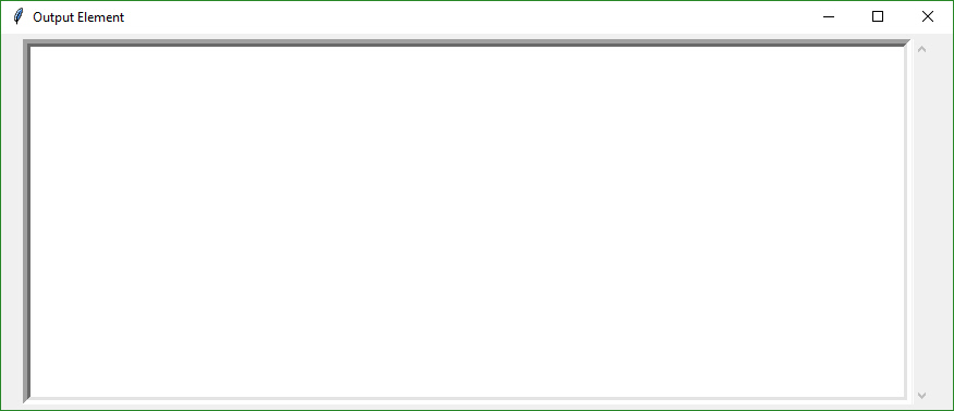
Output Element
Output re-routes Stdout to a scrolled text box. It's used with Async forms. More on this later.
form.AddRow(gg.Output(size=(100,20)))
Output(scale=(None, None),
       size=(None, None))
.
 scale  - How much to scale size of element
 size - Size of element (width, height) in characters
Input Elements
These make up the majority of the form definition. Optional variables at the Element level override the Form level values (e.g. size is specified in the Element). All input Elements create an entry in the list of return values. A Text Input Element creates a string in the list of items returned.
Text Input Element
layout = [[SG.InputText('Default text')]]
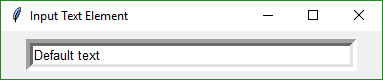
  def InputText(default_text = '',
                scale=(None, None),
                size=(None, None),
                auto_size_text=None,
                password_char='')
.
 default_text - Text initially shown in the input box
 scale - Amount size is scaled by
 size - (width, height) of element in characters
 auto_size_text- Bool.  True is element should be sized to fit text
 password_char - Character that will be used to replace each entered character. Setting to a value indicates this field is a password entry field
Shorthand functions that are equivalent to InputText are Input and In
Combo Element
Also known as a drop-down list. Only required parameter is the list of choices. The return value is a string matching what's visible on the GUI.
layout = [[SG.InputCombo(['choice 1', 'choice 2'])]]
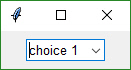
InputCombo(values,
           scale=(None, None),
           size=(None, None),
           auto_size_text=None)
.
 values - Choices to be displayed. List of strings
 scale - Amount to scale size by
 size - (width, height) of element in characters
 auto_size_text - Bool. True if size should fit the text length
Listbox Element
The standard listbox like you'll find in most GUIs. Note that the return values from this element will be a list of results, not a single result. This is because the user can select more than 1 item from the list (if you set the right mode).
layout = [[SG.Listbox(values=['Listbox 1', 'Listbox 2', 'Listbox 3'], size=(30, 6))]]
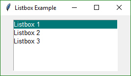
   Listbox(values,
         select_mode=None,
         scale=(None, None),
         size=(None, None),
         auto_size_text=None,
         font=None)
.
values - Choices to be displayed. List of strings
select_mode - Defines how to list is to operate.
     Choices include constants or strings:
     Constants version:
   LISTBOX_SELECT_MODE_BROWSE
   LISTBOX_SELECT_MODE_EXTENDED
   LISTBOX_SELECT_MODE_MULTIPLE
   LISTBOX_SELECT_MODE_SINGLE - the default
   Strings version:
   'browse'
   'extended'
   'multiple'
   'single'
scale - Amount to scale size by
size - (width, height) of element in characters
auto_size_text - Bool. True if size should fit the text length
The select_mode option can be a string or a constant value defined as a variable. Generally speaking strings are used for these kinds of options.
Slider Element
Sliders have a couple of slider-specific settings as well as appearance settings. Examples include the orientation and range settings.
layout = [[SG.Slider(range=(1,500), default_value=222, size=(20,15), orientation='horizontal', font=('Helvetica', 12))]]
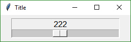
   Slider(range=(None,None),
          default_value=None,
          orientation=None,
          border_width=None,
          relief=None,
          scale=(None, None),
          size=(None, None),
          font=None):
.
  range - (min, max) slider's range
  default_value - default setting (within range)
  orientation - 'horizontal' or 'vertical' ('h' or 'v' work)
  border_width - how deep the widget looks
  relief - relief style. Values are same as progress meter relief values.  Can be a constant or a string:
     RELIEF_RAISED= 'raised'
     RELIEF_SUNKEN= 'sunken'
     RELIEF_FLAT= 'flat'
     RELIEF_RIDGE= 'ridge'
     RELIEF_GROOVE= 'groove'
     RELIEF_SOLID = 'solid'
  scale - Amount to scale size by
   size - (width, height) of element in characters
   auto_size_text - Bool. True if size should fit the text
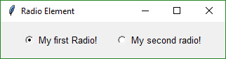
Radio Button Element
Creates one radio button that is assigned to a group of radio buttons. Only 1 of the buttons in the group can be selected at any one time.
layout = [[SG.Radio('My first Radio!', "RADIO1", default=True), SG.Radio('My second radio!', "RADIO1")]]
 Radio(text,
       group_id,
       default=False,
       scale=(None, None),
       size=(None, None),
       auto_size_text=None,
       font=None)
.
 text - Text to display next to button
 group_id - Groups together multiple Radio Buttons. Can be any value
 default - Bool.  Initial state
 scale - Amount to scale size of element
 size- (width, height) size of element in characters
 auto_size_text - Bool.  True if should size width to fit text
 font - Font type and size for text display
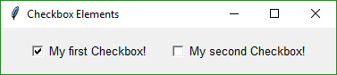
Checkbox Element
Checkbox elements are like Radio Button elements. They return a bool indicating whether or not they are checked.
layout = [[SG.Checkbox('My first Checkbox!', default=True), SG.Checkbox('My second Checkbox!')]]
Checkbox(text,
         default=False,
         scale=(None, None),
         size=(None, None),
         auto_size_text=None,
         font=None):
.
 text - Text to display next to checkbox
 default- Bool.  Initial state
 scale - Amount to scale size of element
 size - (width, height) size of element in characters
 auto_size_text- Bool.  True if should size width to fit text
 font- Font type and size for text display
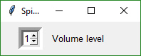
Spin Element
An up/down spinner control. The valid values are passed in as a list.
layout = [[SG.Spin([i for i in range(1,11)], initial_value=1), SG.Text('Volume level')]]
Spin(values,
     intiial_value=None,
     scale=(None, None),
     size=(None, None),
     auto_size_text=None,
     font=None)
.
 values - List of valid values
 initial_value - String with initial value
 scale - Amount to scale size of element
 size - (width, height) size of element in characters
 auto_size_text - Bool.  True if should size width to fit text
 font - Font type and size for text display
Button Element
Buttons are the most important element of all! They cause the majority of the action to happen. After all, it's a button press that will get you out of a form, whether it but Submit or Cancel, one way or another a button is involved in all forms. The only exception is to this is when the user closes the window using the "X" in the upper corner which means no button was involved.
The Types of buttons include:
- Folder Browse
- File Browse
- Close Form
- Read Form
- Realtime
Close Form - Normal buttons like Submit, Cancel, Yes, No, etc, are "Close Form" buttons. They cause the input values to be read and then the form is closed, returning the values to the caller.
Folder Browse - When clicked a folder browse dialog box is opened. The results of the Folder Browse dialog box are written into one of the input fields of the form.
File Browse - Same as the Folder Browse except rather than choosing a folder, a single file is chosen.
Read Form - This is an async form button that will read a snapshot of all of the input fields, but does not close the form after it's clicked.
Realtime - This is another async form button. Normal button clicks occur after a button's click is released. Realtime buttons report a click the entire time the button is held down.
While it's possible to build forms using the Button Element directly, you should never need to do that. There are pre-made buttons and shortcuts that will make life much easier. The most basic Button element call to use is SimpleButton
SimpleButton(text,
             scale=(None, None),
             size=(None, None),
             auto_size_button=None,
             button_color=None,
             font=None)
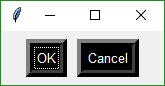
Pre-made buttons include:
OK
Ok
Submit
Cancel
Yes
No
FileBrowse
FolderBrowse
. layout = [[SG.OK(), SG.Cancel()]]
The FileBrowse and FolderBrowse buttons both fill-in values into a text input field somewhere on the form. The location of the TextInput element is specified by the Target variable in the function call. The Target is specified using a grid system. The rows in your GUI are numbered starting with 0. The target can be specified as a hard coded grid item or it can be relative to the button.
The default value for Target is (ThisRow, -1). ThisRow is a special value that tells the GUI to use the same row as the button. The Y-value of -1 means the field one value to the left of the button. For a File or Folder Browse button, the field that it fills are generally to the left of the button is most cases.
Let's examine this form as an example:
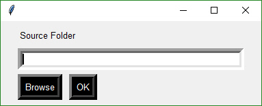
The InputText element is located at (1,0)... row 1, column 0. The Browse button is located at position (2,0). The Target for the button could be any of these values:
Target = (1,0)
Target = (-1,0)
The code for the entire form could be:
layout =  [[SG.T('Source Folder')],
           [SG.In()],
           [SG.FolderBrowse(Target=(-1,0)), SG.OK()]]
Custom Buttons
Not all buttons are created equal. A button that closes a form is different that a button that returns from the form without closing it. If you want to define your own button, you will generally do this with the Button Element SimpleButton, which closes the form when clicked.
layout = [[SG.SimpleButton('My Button')]]
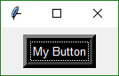
All buttons can have their text changed by changing the button_text variable in the button call. It is this text that is returned when a form is read. This text will be what tells you which button is called so make it unique. Most of the convenience buttons (Submit, Cancel, Yes, etc) are all SimpleButtons. The two that are not are FileBrowse and FolderBrowse. They clearly do not close the form. Instead they bring up a file or folder browser dialog box.
Button Images Now this is an exciting feature not found in many simplified packages.... images on buttons! You can make a pretty spiffy user interface with the help of a few button images.
Your button images need to be in PNG or GIF format. When you make a button with an image, set the button background to the same color as the background. There's a button color TRANSPARENT_BUTTON that you can set your button color to in order for it to blend into the background. Note that this value is currently the same as the color as the default system background on Windows.
This example comes from the Demo Media Player.py example program. Because it's a non-blocking button, it's defined as ReadFormButton. You also put images on blocking buttons by using SimpleButton.
sg.ReadFormButton('Restart Song', button_color=sg.TRANSPARENT_BUTTON,
                   image_filename=image_restart, image_size=(50, 50), image_subsample=2, border_width=0)
Three parameters are used for button images.
image_filename - Filename. Can be a relative path
image_size - Size of image file in pixels
image_subsample - Amount to divide the size by.  2 means your image will be 1/2 the size.  3 means 1/3
Here's an example form made with button images.
You'll find the source code in the file Demo Media Player. Here is what the button calls look like to create media player form
sg.ReadFormButton('Pause', button_color=sg.TRANSPARENT_BUTTON,
                  image_filename=image_pause, image_size=(50, 50), image_subsample=2, border_width=0)
This is one you'll have to experiment with at this point. Not up for an exhaustive explanation.
Realtime Buttons
Normally buttons are considered "clicked" when the mouse button is let UP after a downward click on the button. What about times when you need to read the raw up/down button values. A classic example for this is a robotic remote control. Building a remote control using a GUI is easy enough. One button for each of the directions is a start. Perhaps something like this:
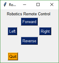
This form has 2 button types. There's the normal "Simple Button" (Quit) and 4 "Realtime Buttons".
Here is the code to make, show and get results from this form:
form = sg.FlexForm('Robotics Remote Control', auto_size_text=True)

form_rows = [[sg.Text('Robotics Remote Control')],
             [sg.T(' '*10), sg.RealtimeButton('Forward')],
             [ sg.RealtimeButton('Left'), sg.T(' '*15), sg.RealtimeButton('Right')],
             [sg.T(' '*10), sg.RealtimeButton('Reverse')],
             [sg.T('')],
             [sg.Quit(button_color=('black', 'orange'))]
             ]

form.LayoutAndRead(form_rows, non_blocking=True)
Somewhere later in your code will be your main event loop. This is where you do your polling of devices, do input/output, etc. It's here that you will read your form's buttons.
while (True):
    # This is the code that reads and updates your window
    button, values = form.ReadNonBlocking()
    if button is not None:
        sg.Print(button)
    if button == 'Quit'  or values is None:
        break
  time.sleep(.01)
This loop will read button values and print them. When one of the Realtime buttons is clicked, the call to form.ReadNonBlocking will return a button name matching the name on the button that was depressed. It will continue to return values as long as the button remains depressed. Once released, the ReadNonBlocking will return None for buttons ules anutton was clicked.
File Types
The FileBrowse button has an additional setting named file_types. This variable is used to filter the files shown in the file dialog box. The default value for this setting is
FileTypes=(("ALL Files", "*.*"),)
This code produces a form where the Browse button only shows files of type .TXT
layout = [[SG.In() ,SG.FileBrowse(file_types=(("Text Files", "*.txt"),))]]
The ENTER key The ENTER key is an important part of data entry for forms. There's a long tradition of the enter key being used to quickly submit forms. PySimpleGUI implements this by tying the ENTER key to the first button that closes or reads a form. If there are more than 1 button on a form, the FIRST button that is of type Close Form or Read Form is used. First is determined by scanning the form, top to bottom and left to right.
ProgressBar
The ProgressBar element is used to build custom Progress Bar forms. It is HIGHLY recommended that you use the functions that provide a complete progress meter solution for you. Progress Meters are not easy to work with because the forms have to be non-blocking and they are tricky to debug.
The easiest way to get progress meters into your code is to use the EasyProgessMeter API. This consists of a pair of functions, EasyProgessMeter and EasyProgressMeterCancel. You can easily cancel any progress meter by calling it with the current value = max value. This will mark the meter as expired and close the window.
You've already seen EasyProgressMeter calls presented earlier in this readme.
SG.EasyProgressMeter('My Meter', i+1, 1000, 'Optional message')
The return value for EasyProgressMeter is:
True if meter updated correctly
False if user clicked the Cancel button, closed the form, or vale reached the max value.
Customized Progress Bar
If you want a bit more customization of your meter, then you can go up 1 level and use the calls to ProgressMeter and ProgressMeterUpdate. These APIs behave like an object we're all used to. First you create the ProgressMeter object, then you call the Update method to update it.
You setup the progress meter by calling
my_meter = ProgressMeter(title,
                    max_value,
                    *args,
                    orientantion=None,
                    bar_color=DEFAULT_PROGRESS_BAR_COLOR,
                    button_color=None,
                    size=DEFAULT_PROGRESS_BAR_SIZE,
                    scale=(None, None),
                    border_width=DEFAULT_PROGRESS_BAR_BORDER_WIDTH)
Then to update the bar within your loop
return_code = ProgressMeterUpdate(my_meter,
                                 value,
                                 *args):
Putting it all together you get this design pattern
my_meter = SG.ProgressMeter('Meter Title', 100000, orentation='Vert')

for i in range(0, 100000):
    SG.ProgressMeterUpdate(my_meter, i+1, 'Some variable', 'Another variable')
The final way of using a Progress Meter with PySimpleGUI is to build a custom form with a ProgressBar Element in the form. You will need to run your form as a non-blocking form. When you are ready to update your progress bar, you call the UpdateBar method for the ProgressBar element itself.
Output
The Output Element is a re-direction of Stdout. Anything "printed" will be displayed in this element.
Output(scale=(None, None),
       size=(None, None))
Here's a complete solution for a chat-window using an Async form with an Output Element
import PySimpleGUI as SG
    # Blocking form that doesn't close
def ChatBot():
    with SG.FlexForm('Chat Window', auto_size_text=True, default_element_size=(30, 2)) as form:
        layout = [[(SG.Text('This is where standard out is being routed', size=[40, 1]))],
                    [SG.Output(size=(80, 20))],
                    [SG.Multiline(size=(70, 5), enter_submits=True), SG.ReadFormButton('SEND', button_color=(SG.YELLOWS[0], SG.BLUES[0])), SG.SimpleButton('EXIT', button_color=(SG.YELLOWS[0], SG.GREENS[0]))]]
        # notice this is NOT the usual LayoutAndRead call because you don't yet want to read the form
       # if you call LayoutAndRead from here, then you will miss the first button click
       form.Layout(layout)
        # ---===--- Loop taking in user input and using it to query HowDoI web oracle --- #
       while True:
            button, value = form.Read()
            if button == 'SEND':
                print(value)
            else:
                break
Tabbed Forms
Tabbed forms are shown using the ShowTabbedForm call. The call has the format
 results = ShowTabbedForm('Title for the form',
                          (form,layout,'Tab 1 label'),
                          (form2,layout2, 'Tab 2 label'), ...)
Each of the tabs of the form is in fact a form. The same steps are taken to create the form as before. A FlexForm is created, then rows are filled with Elements, and finally the form is shown. When calling ShowTabbedForm, each form is passed in as a tuple. The tuple has the format: (the form, the rows, a string shown on the tab)
Results are returned as a list of lists. For each form you'll get a list that's in the same format as a normal form. A single tab's values would be:
(button, (values))
Recall that values is a list as well. Multiple tabs in the form would return like this:
((button1, (values1)), (button2, (values2))
Colors
Starting in version 2.5 you can change the background colors for the window and the Elements.
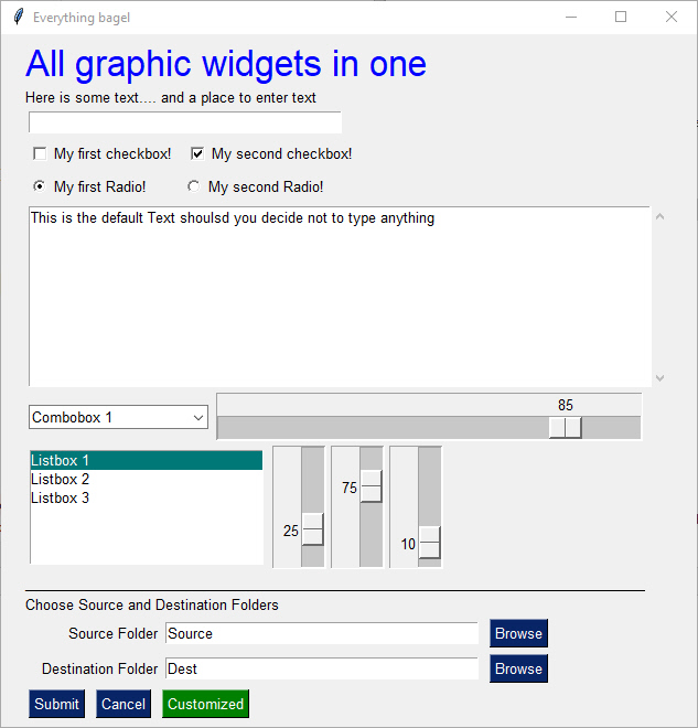
Your forms can go from this:
to this... with one function call...
While you can do it on an element by element or form level basis, the easiest way, by far, is a call to SetOptions.
Be aware that once you change these options they are changed for the rest of your program's execution. All of your forms will have that look and feel, until you change it to something else (which could be the system default colors.
This call sets all of the different color options.
SetOptions(background_color='#9FB8AD',
           text_element_background_color='#9FB8AD',
           element_background_color='#9FB8AD',
           scrollbar_color=None,
           input_elements_background_color='#F7F3EC',
           progress_meter_color = ('green', 'blue')
           button_color=('white','#475841'))
Global Settings
Global Settings
Let's have some fun customizing! Make PySimpleGUI look the way you want it to look. You can set the global settings using the function PySimpleGUI.SetOptions. Each option has an optional parameter that's used to set it.
SetOptions(icon=None
		   button_color=(None,None)
		   element_size=(None,None),
		   margins=(None,None),
		   element_padding=(None,None)
		   auto_size_text=None
		   auto_size_buttons=None
		   font=None
		   border_width=None
           slider_border_width=None
           slider_relief=None
           slider_orientation=None
           autoclose_time=None
           message_box_line_width=None
           progress_meter_border_depth=None
           progress_meter_style=None
           progress_meter_relief=None
           progress_meter_color=None
           progress_meter_size=None
           text_justification=None
           background_color=None
           element_background_color=None
           text_element_background_color=None
           input_elements_background_color=None
           scrollbar_color=None, text_color=None
           debug_win_size=(None,None)
           window_location=(None,None)
Explanation of parameters
         icon - filename of icon used for taskbar and title bar
         button_color - button color (foreground, background)
         element_size - element size (width, height) in characters
         margins - tkinter margins around outsize
         element_padding - tkinter padding around each element
         auto_size_text - autosize the elements to fit their text
         auto_size_buttons - autosize the buttons to fit their text
         font - font used for elements
         border_width - amount of bezel or border around sunken or raised elements
         slider_border_width - changes the way sliders look
         slider_relief - changes the way sliders look
         slider_orientation - changes orientation of slider
         autoclose_time - time in seconds for autoclose boxes
         message_box_line_width - number of characers in a line of text in message boxes
         progress_meter_border_depth - amount of border around raised or lowered progress meters
         progress_meter_style - style of progress meter as defined by tkinter
         progress_meter_relief - relief style
         progress_meter_color - color of the bar and background of progress meters
         progress_meter_size - size in (characters, pixels)
         background_color - Color of the main window's background
         element_background_color - Background color of the elements
         text_element_background_color - Text element background color
         input_elements_background_color - Input fields background color
         scrollbar_color - Color for scrollbars (may not always work)
         text_color - Text element default text color
         text_justification - justification to use on Text Elements. Values are strings - 'left', 'right', 'center'
         debug_win_size - size of the Print output window
         window_location - location on the screen (x,y) of window's top left cornder
These settings apply to all forms SetOptions. The Row options and Element options will take precedence over these settings. Settings can be thought of as levels of settings with the Form-level being the highest and the Element-level the lowest. Thus the levels are:
- Form level
- Row level
- Element level
Each lower level overrides the settings of the higher level. Once settings have been changed, they remain changed for the duration of the program (unless changed again).
Asynchronous (Non-Blocking) Forms
So you want to be a wizard do ya? Well go boldly! While the majority of GUIs are a simple exercise to "collect input values and return with them", there are instances where we want to continue executing while the form is open. These are "asynchronous" forms and require special options, new SDK calls, and great care. With asynchronous forms the form is shown, user input is read, but your code keeps right on chugging. YOUR responsibility is to call PySimpleGUI.ReadNonBlocking on a periodic basis. Once a second or more will produce a reasonably snappy GUI.
When do you use a non-blocking form? A couple of examples are
- A media file player like an MP3 player
- A status dashboard that's periodically updated
- Progress Meters - when you want to make your own progress meters
- Output using print to a scrolled text element. Good for debugging.
Word of warning... version 2.2, the currently released, and upcoming version 2.3 differ in the return code for the ReadNonBlocking call. Previously the function returned 2 values, except when the form is closed using the "X" which returned a single value of None. The new way is that ReadNonBlocking always returns 2 values. If the user closed the form with the "X" then the return values will be None, None. You will want to key off the second value to catch this case.
The proper code to check if the user has exited the form will be a polling-loop that looks something like this:
while True:
   button, values = form.ReadNonBlocking()
   if values is None or button == 'Quit':
      break
We're going to build an app that does the latter. It's going to update our form with a running clock.
The basic flow and functions you will be calling are: Setup
form = FlexForm()
form_rows = .....
form.LayoutAndRead(form_rows, non_blocking=True)
Periodic refresh
form.ReadNonBlocking()
If you need to close the form
form.CloseNonBlockingForm()
Rather than the usual form.LayoutAndRead() call, we're manually adding the rows (doing the layout) and then showing the form. After the form is shown, you simply call form.ReadNonBlocking() every now and then.
When you are ready to close the form (assuming the form wasn't closed by the user or a button click) you simply call form.CloseNonBlockingForm()
Example - Running timer that updates See the sample code on the GitHub named Demo Media Player for another example of Async Forms. We're going to make a form and update one of the elements of that form every .01 seconds. Here's the entire code to do that.
import PySimpleGUI as sg
import time

# form that doesn't block
# Make a form, but don't use context manager
form = sg.FlexForm('Running Timer', auto_size_text=True)
# Create a text element that will be updated with status information on the GUI itself
output_element = sg.Text('', size=(8, 2), font=('Helvetica', 20))
# Create the rows
form_rows = [[sg.Text('Non-blocking GUI with updates')],
             [output_element],
             [sg.SimpleButton('Quit')]]
# Layout the rows of the form and perform a read. Indicate the form is non-blocking!
form.LayoutAndRead(form_rows, non_blocking=True)

#
# Some place later in your code...
# You need to perform a ReadNonBlocking on your form every now and then or
# else it won't refresh
#

for i in range(1, 1000):
    output_element.Update('{:02d}:{:02d}.{:02d}'.format(*divmod(int(i / 100), 60), i % 100))
    button, values = form.ReadNonBlocking()
    if values is None or button == 'Quit':
        break
    time.sleep(.01)
else:
    form.CloseNonBlockingForm()
What we have here is the same sequence of function calls as in the description. Get a form, add rows to it, show the form, and then refresh it every now and then.
The new thing in this example is the call use of the Update method for the Text Element. The first thing we do inside the loop is "update" the text element that we made earlier. This changes the value of the text field on the form. The new value will be displayed when form.ReadNonBlocking() is called.
Note the else statement on the for loop. This is needed because we're about to exit the loop while the form is still open. The user has not closed the form using the X nor a button so it's up to the caller to close the form using CloseNonBlockingForm.
That's it... this example follows the async design pattern well.
Sample Applications
Use the example programs as a starting basis for your GUI. Copy, paste, modify and run! The demo files are:
Demo Recipes.py - Sample forms for all major form types and situations. This is the place to get your code template from. Includes asynchronous forms, etc.
Demo DisplayHash1and256.py - Demonstrates using High Level API calls to get a filename
Demo DupliucateFileFinder.py - Demonstrates High Level API to get a folder & Easy Progress Meter to show progress of the file scanning
Demo HowDoI.py - An amazing little application. Acts as a front-end to HowDoI. This one program could forever change how you code. It does searches on Stack Overflow and returns the CODE found in the best answer for your query. If anyone wants to help me package this application up, I could use a hand.
Fun Stuff
Here are some things to try if you're bored or want to further customize
Colors - Random and predefined
To set a button or text to a random color, use the string 'random' as the color value. You can also call PySimpleGUI.GetRandomColor.
To get a random color pair call PySimpleGUI.GetRandomColorPair. This returns a tuple containing a random color and that color's compliment.
Debug Output Be sure and check out the EasyPrint (Print) function described in the high-level API section. Leave your code the way it is, route your stdout and stderror to a scrolling window.
For a fun time, add these lines to the top of your script
import PySimpleGUI as sg
print = sg.Print
This will turn all of your print statements into prints that display in a window on your screen rather than to the terminal.
Look and Feel
Dial in the look and feel that you like with the SetOptions function. You can change all of the defaults in one function call. One line of code to customize the entire GUI.
ObjToString Ever wanted to easily display an objects contents easily? Use ObjToString to get a nicely formatted recursive walk of your objects. This statement:
print(sg.ObjToSting(x))
And this was the output
<class '__main__.X'>
    abc = abc
    attr12 = 12
    c = <class '__main__.C'>
        b = <class '__main__.B'>
            a = <class '__main__.A'>
                attr1 = 1
                attr2 = 2
                attr3 = three
            attr10 = 10
            attrx = x
You'll quickly wonder how you ever coded without it.
Known Issues
While not an "issue" this is a stern warning
Do not attempt to call PySimpleGUI from multiple threads! It's tkinter based and tkinter has issues with multiple threads
Progress Meters - the visual graphic portion of the meter may be off. May return to the native tkinter progress meter solution in the future. Right now a "custom" progress meter is used. On the bright side, the statistics shown are extremely accurate and can tell you something about the performance of your code.
Async Forms - these include the 'easy' forms (EasyProgressMeter and EasyPrint/Print). If you start overlapping having Async forms open with normal forms then things get a littler squirrelly. Still tracking down the issues and am making it more solid every day possible. You'll know there's an issue when you see blank form.
EasyPrint - EasyPrint is a new feature that's pretty awesome. You print and the output goes to a window, with a scroll bar, that you can copy and paste from. Being a new feature, it's got some potential problems. There are known interaction problems with other GUI windows. For example, closing a Print window can also close other windows you have open. For now, don't close your debug print window until other windows are closed too.
Contributing
A MikeTheWatchGuy production... entirely responsible for this code.... unless it causes you trouble in which case I'm not at all responsible.
Versions
| Version | Description |
|---|---|
| 1.0.9 | July 10, 2018 - Initial Release |
| 1.0.21 | July 13, 2018 - Readme updates |
| 2.0.0 | July 16, 2018 - ALL optional parameters renamed from CamelCase to all_lower_case |
| 2.1.1 | July 18, 2018 - Global settings exposed, fixes |
| 2.2.0 | July 20, 2018 - Image Elements, Print output |
| 2.3.0 | July 23, 2018 - Changed form.Read return codes, Slider Elements, Listbox element. Renamed some methods but left legacy calls in place for now. |
| 2.4.0 | July 24, 2018 - Button images. Fixes so can run on Raspberry Pi |
| 2.5.0 | July 26, 2018 - Colors. Listbox scrollbar. tkinter Progress Bar instead of homegrown. |
| 2.6.0 | July 27, 2018 - auto_size_button setting. License changed to LGPL 3+ |
| 2.6.5 | Aug XX, 2018 - window_location default setting |
Release Notes
2.3 - Sliders, Listbox's and Image elements (oh my!)
If using Progress Meters, avoid cancelling them when you have another window open. It could lead to future windows being blank. It's being worked on.
New debug printing capability. sg.Print
2.5 Discovered issue with scroll bar on Output elements. The bar will match size of ROW not the size of the element. Normally you never notice this due to where on a form the Output element goes.
Listboxes are still without scrollwheels. The mouse can drag to see more items. The mouse scrollwheel will also scroll the list and will page up and page down keys.
Upcoming
Make suggestions people! Future release features
Columns. How multiple columns would be specified in the SDK interface are still being designed.
Port to other graphic engines. Hook up the front-end interface to a backend other than tkinter. Qt, WxPython, etc.
Code Condition
Make it run
Make it right
Make it fast
It's a recipe for success if done right. PySimpleGUI has completed the "Make it run" phase. It's far from "right" in many ways. These are being worked on. The module is particularly poor for PEP 8 compliance. It was a learning exercise that turned into a somewhat complete GUI solution for lightweight problems.
While the internals to PySimpleGUI are a tad sketchy, the public interfaces into the SDK are more strictly defined and comply with PEP 8 for the most part.
Please log bugs and suggestions in the GitHub! It will only make the code stronger and better in the end, a good thing for us all, right?
Design
A moment about the design-spirit of PySimpleGUI. From the beginning, this package was meant to take advantage of Python's capabilities with the goal of programming ease.
Single File While not the best programming practice, the implementation resulted in a single file solution. Only one file is needed, PySimpleGUI.py. You can post this file, email it, and easily import it using one statement.
Functions as objects
In Python, functions behave just like object. When you're placing a Text Element into your form, you may be sometimes calling a function and other times declaring an object. If you use the word Text, then you're getting an object. If you're using Txt, then you're calling a function that returns a Text object.
Lists It seemed quite natural to use Python's powerful list constructs when possible. The form is specified as a series of lists. Each "row" of the GUI is represented as a list of Elements. When the form read returns the results to the user, all of the results are presented as a single list. This makes reading a form's values super-simple to do in a single line of Python code.
Authors
MikeTheWatchGuy
License
GNU Lesser General Public License (LGPL 3) +
Acknowledgments
- Jorj McKie was the motivator behind the entire project. His wxsimpleGUI concepts sparked PySimpleGUI into existence
How Do I
Finally, I must thank the fine folks at How Do I. https://github.com/gleitz/howdoi Their utility has forever changed the way and pace in which I can program. I urge you to try the HowDoI.py application here on GitHub. Trust me, it's going to be worth the effort! Here are the steps to run that application
Install howdoi:
      pip install howdoi
Test your install:
      python -m howdoi howdoi.py
To run it:
      Python HowDoI.py
The pip command is all there is to the setup.
The way HowDoI works is that it uses your search term to look through stack overflow posts. It finds the best answer, gets the code from the answer, and presents it as a response. It gives you the correct answer OFTEN. It's a miracle that it work SO well.
For Python questions, I simply start my query with 'Python'. Let's say you forgot how to reverse a list in Python. When you run HowDoI and ask this question, this is what you'll see.
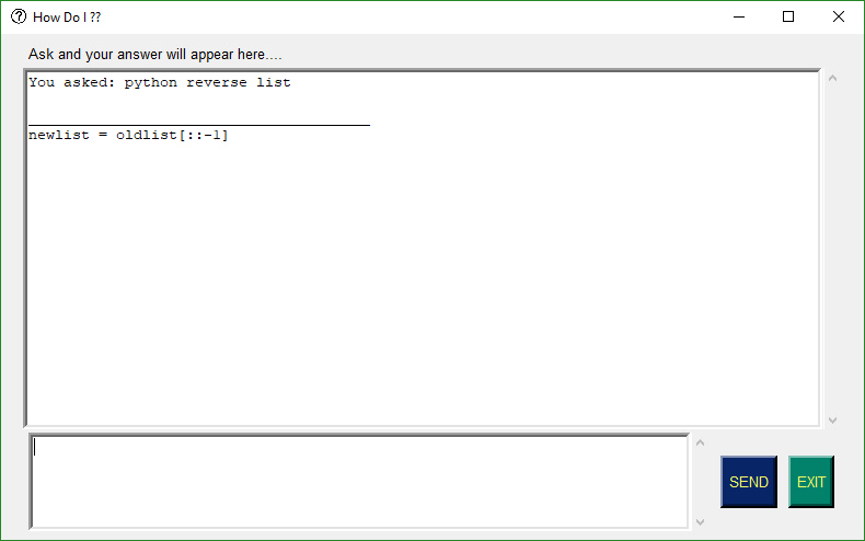
In the hands of a competent programmer, this tool is amazing. It's a must-try kind of program that has completely changed my programming process. I'm not afraid of asking for help! You just have to be smart about using what you find.
The PySimpleGUI window that the results are shown in is an 'input' field which means you can copy and paste the results right into your code.
Release history Release notifications | RSS feed


Download files
Download the file for your platform. If you're not sure which to choose, learn more about installing packages.
Source Distribution
Built Distribution
Hashes for PySimpleGUI-2.7.0-py3-none-any.whl
| Algorithm | Hash digest | |
|---|---|---|
| SHA256 | 7517c7d6e00667a38afc8cef4d0f7010c3c5cea6c12b09c10f9c50156b15c46f |
|
| MD5 | 7a89ae01390013871b80bdb7483b8418 |
|
| BLAKE2b-256 | a0c253681d8fdd88241b1893c8c5686449aed0967559186895dc5fd577230bdd |