Simple tools to plot learning curves of neural network models created by scikit-learn or keras framework.

Project description
lcurvetools
Simple tools for Python language to plot learning curves of a neural network model trained with the keras or scikit-learn framework.
NOTE: All of the plotting examples below are for interactive Python mode in Jupyter-like environments. If you are in non-interactive mode you may need to explicitly call matplotlib.pyplot.show to display the window with built plots on your screen.
The lcurves_by_history function to plot learning curves by the history attribute of the keras History object
Neural network model training with keras is performed using the fit method. The method returns the History object with the history attribute which is dictionary and contains keys with training and validation values of losses and metrics, as well as learning rate values at successive epochs. The lcurves_by_history function uses the History.history dictionary to plot the learning curves as the dependences of the above values on the epoch index.
Usage scheme
- Import the
kerasmodule and thelcurves_by_historyfunction:
import keras
from lcurvetools import lcurves_by_history
model = keras.Model(...) # or keras.Sequential(...)
model.compile(...)
hist = model.fit(...)
- Use
hist.historydictionary to plot the learning curves as the dependences of values of all keys in the dictionary on an epoch index with automatic recognition of keys of losses, metrics and learning rate:
lcurves_by_history(hist.history);
Typical appearance of the output figure
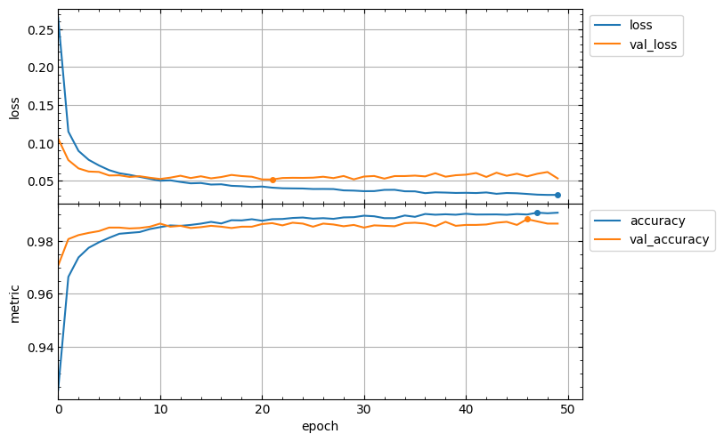
The appearance of the output figure depends on the list of keys in the hist.history dictionary, which is determined by the parameters of the compile and fit methods of the model. For example, for a typical usage of these methods, the list of keys would be ['loss', 'accuracy', 'val_loss', 'val_accuracy'] and the output figure will contain 2 subplots with loss and metrics vertical axes and might look like this:
model.compile(loss="categorical_crossentropy", metrics=["accuracy"])
hist = model.fit(x_train, y_train, validation_split=0.1, epochs=50)
lcurves_by_history(hist.history);
Of course, if the metrics parameter of the compile method is not specified, then the output figure will not contain a metric subplot.
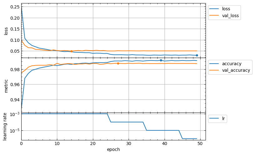
Usage of callbacks for the fit method can add new keys to the hist.history dictionary. For example, the ReduceLROnPlateau callback adds the lr key with learning rate values for successive epochs. In this case the output figure will contain additional subplot with learning rate vertical axis in a logarithmic scale and might look like this:
hist = model.fit(x_train, y_train, validation_split=0.1, epochs=50,
    callbacks=keras.callbacks.ReduceLROnPlateau(),
)
lcurves_by_history(hist.history);
Customizing appearance of the output figure
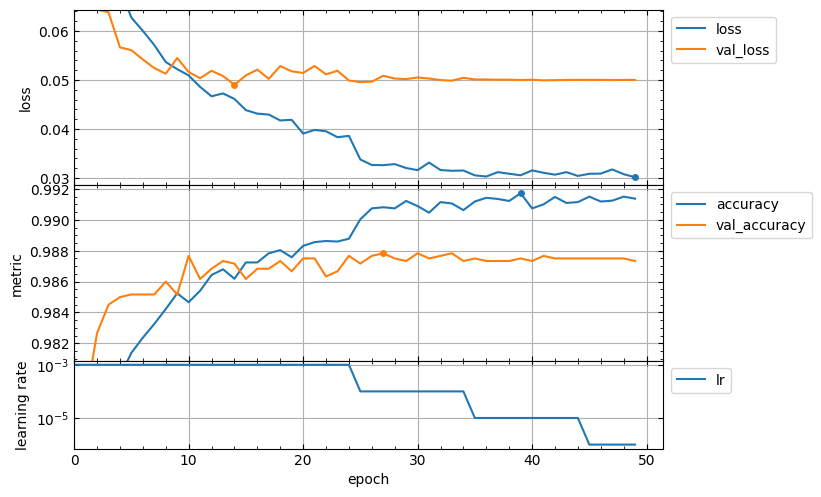
The lcurves_by_history function has optional parameters to customize the appearance of the output figure. For example, the epoch_range_to_scale option allows to specify the epoch index range within which the subplots of the losses and metrics are scaled.
- If
epoch_range_to_scaleis a list or a tuple of two int values, then they specify the epoch index limits of the scaling range in the form[start, stop), i.e. as forsliceandrangeobjects. - If
epoch_range_to_scaleis an int value, then it specifies the lower epoch indexstartof the scaling range, and the losses and metrics subplots are scaled by epochs with indices fromstartto the last.
So, you can exclude the first 5 epochs from the scaling range as follows:
lcurves_by_history(hist.history, epoch_range_to_scale=5);
For a description of other optional parameters of the lcurves_by_history function to customize the appearance of the output figure, see its docstring.
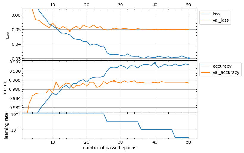
The lcurves_by_history function returns a numpy array or a list of the matplotlib.axes.Axes objects corresponded to the built subplots from top to bottom. So, you can use the methods of these objects to customize the appearance of the output figure.
axs = lcurves_by_history(history, initial_epoch=1, epoch_range_to_scale=6)
axs[0].tick_params(axis="x", labeltop=True)
axs[-1].set_xlabel('number of passed epochs')
axs[-1].legend().remove()
The history_concatenate function to concatenate two History.history dictionaries
This function is useful for combining histories of model fitting with two or more runs into a single history to plot full learning curves.
Usage scheme
- Import the
kerasmodule and thehistory_concatenate,lcurves_by_historyfunction:
import keras
from lcurvetools import history_concatenate, lcurves_by_history
model = keras.Model(...) # or keras.Sequential(...)
model.compile(...)
hist1 = model.fit(...)
- Compile as needed and fit using possibly other parameter values:
model.compile(...) # optional
hist2 = model.fit(...)
- Concatenate the
.historydictionaries into one:
full_history = history_concatenate(hist1.history, hist2.history)
- Use
full_historydictionary to plot full learning curves:
lcurves_by_history(full_history);
The lcurves_by_MLP_estimator function to plot learning curves of the scikit-learn MLP estimator
The scikit-learn library provides 2 classes for building multi-layer perceptron (MLP) models of classification and regression: MLPClassifier and MLPRegressor. After creation and fitting of these MLP estimators with using early_stopping=True the MLPClassifier and MLPRegressor objects have the loss_curve_ and validation_scores_ attributes with train loss and validation score values at successive epochs. The lcurves_by_history function uses the loss_curve_ and validation_scores_ attributes to plot the learning curves as the dependences of the above values on the epoch index.
Usage scheme
- Import the
MLPClassifier(orMLPRegressor) class and thelcurves_by_MLP_estimatorfunction:
from sklearn.neural_network import MLPClassifier
from lcurvetools import lcurves_by_MLP_estimator
clf = MLPClassifier(..., early_stopping=True)
clf.fit(...)
- Use
clfobject withloss_curve_andvalidation_scores_attributes to plot the learning curves as the dependences of loss and validation score values on epoch index:
lcurves_by_MLP_estimator(clf)
Typical appearance of the output figure
The lcurves_by_MLP_estimator function with default value of the parameter on_separate_subplots=False shows the learning curves of loss and validation score on one plot with two vertical axes scaled independently. Loss values are plotted on the left axis and validation score values are plotted on the right axis. The output figure might look like this:
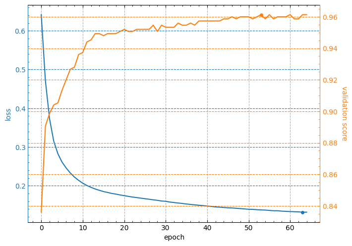
Note: the minimum value of loss curve and the maximum value of validation score curve are marked by points.
Customizing appearance of the output figure
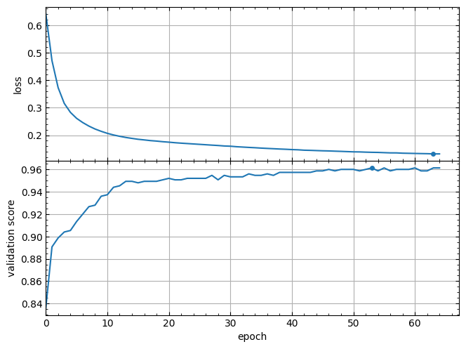
The lcurves_by_MLP_estimator function has optional parameters to customize the appearance of the output figure. For example,the lcurves_by_MLP_estimator function with on_separate_subplots=True shows the learning curves of loss and validation score on two separated subplots:
lcurves_by_MLP_estimator(clf, on_separate_subplots=True)
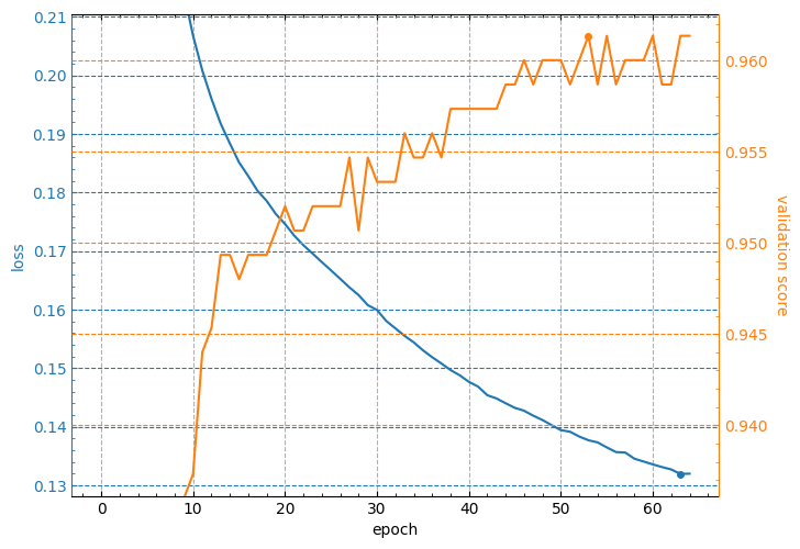
And the epoch_range_to_scale option allows to specify the epoch index range within which the subplots of the losses and metrics are scaled (see details about this option in the docstring of the lcurves_by_MLP_estimator function).
lcurves_by_MLP_estimator(clf, epoch_range_to_scale=10);
For a description of other optional parameters of the lcurves_by_MLP_estimator function to customize the appearance of the output figure, see its docstring.
The lcurves_by_MLP_estimator function returns a numpy array or a list of the matplotlib.axes.Axes objects of an output figure (see additional details in the Returns section of the lcurves_by_MLP_estimator function docstring). So, you can use the methods of these objects to customize the appearance of the output figure.
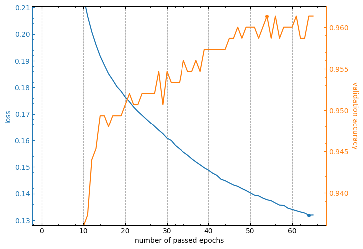
axs = lcurves_by_MLP_estimator(clf, initial_epoch=1, epoch_range_to_scale=11);
axs[0].grid(axis='y', visible=False)
axs[1].grid(axis='y', visible=False)
axs[0].set_xlabel('number of passed epochs')
axs[1].set_ylabel('validation accuracy');
CHANGELOG
Version 1.0.0
Initial release.
Release history Release notifications | RSS feed

Download files
Download the file for your platform. If you're not sure which to choose, learn more about installing packages.
Source Distribution
Built Distribution
Hashes for lcurvetools-1.0.0-py3-none-any.whl
| Algorithm | Hash digest | |
|---|---|---|
| SHA256 | 963236bf42c24d8de21908c4aba89ccec52fa97efab9ecc2ab5a692fde134834 |
|
| MD5 | c780369f79274ed3cdec1e6e45c2fb41 |
|
| BLAKE2b-256 | 518d2dca13095436c958b95f44cbf8475fc70a75152f984fb610425775fa152d |


