Sphinx extension to render the image by script or command

Project description
A sphinx extension to plot all kind of graph from script or command.
It’s could be generated by the foolowing plot directive.:
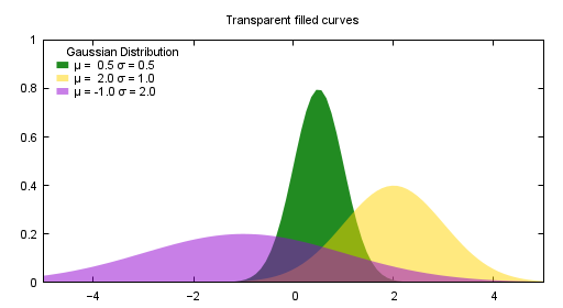
.. plot:: gnuplot
    :caption: figure 3. illustration for gnuplot
    :size: 500,300

    set style fill transparent solid 0.5 noborder
    set style function filledcurves y1=0

    Gauss(x,mu,sigma) = 1./(sigma*sqrt(2*pi)) * exp( -(x-mu)**2 / (2*sigma**2) )
    d1(x) = Gauss(x, 0.5, 0.5)
    d2(x) = Gauss(x,  2.,  1.)
    d3(x) = Gauss(x, -1.,  2.)

    set xrange [-5:5]
    set yrange [0:1]
    set key title "Gaussian Distribution"
    set key top left Left reverse samplen 1
    set title "Transparent filled curves"
    plot d1(x) fs solid 1.0 lc rgb "forest-green" title "μ =  0.5 σ = 0.5", \
         d2(x) lc rgb "gold" title "μ =  2.0 σ = 1.0", \
         d3(x) lc rgb "dark-violet" title "μ = -1.0 σ = 2.0"
1. Installing and setup
pip install sphinxcontrib-plot
And just add sphinxcontrib.plot to the list of extensions in the conf.py file. For example:
extensions = ['sphinxcontrib.plot']
2. Introduction and examples
In rst we we use image and figure directive to render image/figure. In fact we can plot anything in rst as it was on shell. For examples:
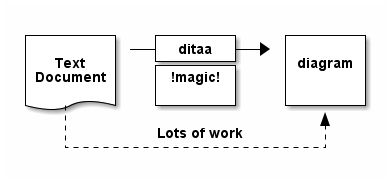
2.1 ditaa example
ditaa is a small command-line utility that can convert diagrams drawn using ascii art (‘drawings’ that contain characters that resemble lines like | / - ), into proper bitmap graphics. We could use the following directive to render the image generated by ditaa:
.. plot:: ditaa
   :caption: figure 1. illustration for ditaa

    +--------+   +-------+    +-------+
    |        | --+ ditaa +--> |       |
    |  Text  |   +-------+    |diagram|
    |Document|   |!magic!|    |       |
    |     {d}|   |       |    |       |
    +---+----+   +-------+    +-------+
        :                         ^
        |       Lots of work      |
        +-------------------------+
Or plot it with parameters:
.. plot:: ditaa --svg
   :caption: figure 2. illustration for ditaa with option

      +--------+   +-------+    +-------+
      |        | --+ ditaa +--> |       |
      |  Text  |   +-------+    |diagram|
      |Document|   |!magic!|    |       |
      |     {d}|   |       |    |       |
      +---+----+   +-------+    +-------+
          :                         ^
          |       Lots of work      |
          +-------------------------+
After convert using ditaa, the above file becomes:
2.2 gnuplot example
Another example is gnuplot.:
.. plot:: gnuplot
    :caption: figure 3. illustration for gnuplot
    :size: 500,300

    set style fill transparent solid 0.5 noborder
    set style function filledcurves y1=0

    Gauss(x,mu,sigma) = 1./(sigma*sqrt(2*pi)) * exp( -(x-mu)**2 / (2*sigma**2) )
    d1(x) = Gauss(x, 0.5, 0.5)
    d2(x) = Gauss(x,  2.,  1.)
    d3(x) = Gauss(x, -1.,  2.)

    set xrange [-5:5]
    set yrange [0:1]
    set key title "Gaussian Distribution"
    set key top left Left reverse samplen 1
    set title "Transparent filled curves"
    plot d1(x) fs solid 1.0 lc rgb "forest-green" title "μ =  0.5 σ = 0.5", \
         d2(x) lc rgb "gold" title "μ =  2.0 σ = 1.0", \
         d3(x) lc rgb "dark-violet" title "μ = -1.0 σ = 2.0"
After convert using gnuplot, the above file becomes:
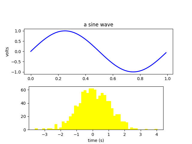
2.3 python example
Another example is mulplotlib.plot.
.. plot:: python
    :caption: figure 4. illustration for python

    import numpy as np
    import matplotlib.pyplot as plt

    fig = plt.figure()
    fig.subplots_adjust(top=0.8)
    ax1 = fig.add_subplot(211)
    ax1.set_ylabel('volts')
    ax1.set_title('a sine wave')

    t = np.arange(0.0, 1.0, 0.01)
    s = np.sin(2*np.pi*t)
    line, = ax1.plot(t, s, color='blue', lw=2)

    # Fixing random state for reproducibility
    np.random.seed(19680801)

    ax2 = fig.add_axes([0.15, 0.1, 0.7, 0.3])
    n, bins, patches = ax2.hist(np.random.randn(1000), 50,
                                facecolor='yellow', edgecolor='yellow')
    ax2.set_xlabel('time (s)')
    plt.savefig("sphx_glr_artists_001.png")
After conversion using python, we could get the following image:
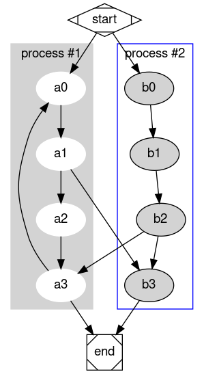
2.4 graphviz(dot) example
Another example is graphivx(dot), since we want to generate png image, we add the option in the command, it’s dot’s own option:
.. plot:: dot -Tpng
    :caption: illustration for dot

    digraph G {

            subgraph cluster_0 {
                    style=filled;
                    color=lightgrey;
                    node [style=filled,color=white];
                    a0 -> a1 -> a2 -> a3;
                    label = "process #1";
            }

            subgraph cluster_1 {
                    node [style=filled];
                    b0 -> b1 -> b2 -> b3;
                    label = "process #2";
                    color=blue
            }
            start -> a0;
            start -> b0;
            a1 -> b3;
            b2 -> a3;
            a3 -> a0;
            a3 -> end;
            b3 -> end;

            start [shape=Mdiamond];
            end [shape=Msquare];
    }
After convert using dot, the above file becomes:
2.5 convert example
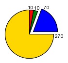
Another example is convert. You can write the command in the commnad line:
.. plot::
:caption: illustration for convert

convert rose:  -fill none -stroke white -draw 'line 5,40 65,5'  rose_raw.png
This is the output:

or you can write most of the command line in the body:
.. plot::
    :caption: illustration for convert

    convert
    -size 140x130 xc:white -stroke black \
    -fill red   -draw "path 'M 60,70 L   60,20   A 50,50 0 0,1 68.7,20.8 Z'" \
    -fill green -draw "path 'M 60,70 L 68.7,20.8 A 50,50 0 0,1 77.1,23.0 Z'" \
    -fill blue  -draw "path 'M 68,65 L 85.1,18.0 A 50,50 0 0,1  118,65   Z'" \
    -fill gold  -draw "path 'M 60,70 L  110,70   A 50,50 0 1,1   60,20   Z'" \
    -fill black -stroke none  -pointsize 10 \
    -draw "text 57,19 '10' text 70,20 '10' text 90,19 '70' text 113,78 '270'" \
    piechart.jpg
2.6 Other applications
In theory, All the command which could generate graph could be used after the directive “..plot::”. Please report it when you found anyone which works or doesn’t work.
3 Options
sphinxcontrib-plot provide some options for easy use.
3.1 command options
First of all, you can add any parameter after the command. sphinxcontrib-plot doesn’t know and interfere with it and only get the graph after it’s executed. for example:
.. plot:: ditaa --no-antialias -s 2
   :caption: figure 1. illustration for ditaa with option.

    +--------+   +-------+    +-------+
    |        | --+ ditaa +--> |       |
    |  Text  |   +-------+    |diagram|
    |Document|   |!magic!|    |       |
    |     {d}|   |       |    |       |
    +---+----+   +-------+    +-------+
        :                         ^
        |       Lots of work      |
        +-------------------------+
3.2 sphinxcontrib-plot options
- size:
Control the output image size for gnuplot.
- suffix:
Control the output image format.
- convert:
After the image is generate, if you’d like to add some watermark, use convert to do that
- show_source:
for text generated iamge, if the source code is shown.
- caption:
The title for the image.
- name:
the reference name for the image.
Besdies that, you can use any options of figure and image since it is figure in nature.
For example:
.. plot:: gnuplot
    :caption: figure 1. illustration for gnuplot with watermark.
    :convert: -stroke red -strokewidth 2 -fill none -draw "line 100,100
             200, 200"
    :size: 900,600
    :width: 600

    plot [-5:5] (sin(1/x) - cos(x))*erfc(x)
3.2 global options
Please add the following option into you conf.py to designate defualt output file format for different targe.
gnuplot_format = dict(latex=’pdf’, html=’png’)
4. License
GPLv3
5. Changelog
1.0 Initial upload.
Release history Release notifications | RSS feed


Download files
Download the file for your platform. If you're not sure which to choose, learn more about installing packages.


