A collection of helper for table handling and vizualization

Project description
pandas-plots


usage
install / update package
pip install pandas-plots -U
include in python
from pandas_plots import tbl, pls, ven, hlp
example
# load sample dataset from seaborn
import seaborn as sb
df = sb.load_dataset('taxis')
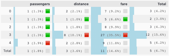
_df = df[["passengers", "distance", "fare"]][:5]
tbl.show_num_df(
    _df,
    total_axis="xy",
    total_mode="mean",
    data_bar_axis="xy",
    pct_axis="xy",
    precision=0,
    kpi_mode="max_min_x",
    kpi_rag_list=(1,7),
)
why use pandas-plots
pandas-plots is a package to help you examine and visualize data that are organized in a pandas DataFrame. It provides a high level api to pandas / plotly with some selected functions and predefined options:
-
tblutilities for table descriptions- 🌟
show_num_df()displays a table as styled version with additional information describe_df()an alternative version of pandasdescribe()functionpivot_df()gets a pivot table of a 3 column dataframe-
⚠️
pivot_df()is depricated and wont get further updates. Its features are well covered in standardpd.pivot_table()
-
- 🌟
-
plsfor plotly visualizationsplot_box()auto annotated boxplot w/ violin optionplot_boxes()multiple boxplots (annotation is experimental)plot_stacked_bars()shortcut to stacked bars 😄plots_bars()a standardized bar plot for a categorical column- features convidence intervals via
use_cioption
- features convidence intervals via
- 🆕
plot_histogram()histogram for one or more numerical columns - 🆕
plot_joints()a joint plot for exactly two numerical columns plot_quadrants()quickly shows a 2x2 heatmap
-
venoffers functions for venn diagramsshow_venn2()displays a venn diagram for 2 setsshow_venn3()displays a venn diagram for 3 sets
-
hlpcontains some (variety) helper functionsdf_to_series()converts a dataframe to a seriesmean_confidence_interval()calculates mean and confidence interval for a serieswrap_text()formats strings or lists to a given width to fit nicely on the screenreplace_delimiter_outside_quotes()when manual import of csv files is needed: replaces delimiters only outside of quotes- 🆕
create_barcode_from_url()creates a barcode from a given URL - 🆕
add_datetime_col()adds a datetime columns to a dataframe
note: theme setting can be controlled through all functions by setting the environment variable
THEMEto either light or dark
more examples
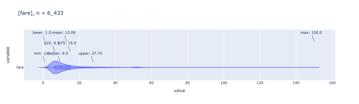
pls.plot_box(df['fare'], height=400, violin=True)
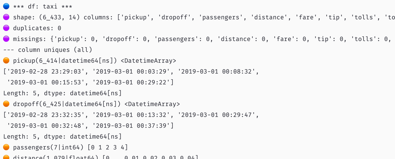
# quick and exhaustive description of any table
tbl.describe_df(df, 'taxis', top_n_uniques=5)
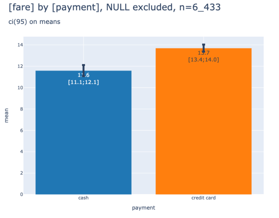
# show bars with confidence intervals
_df = df[["payment", "fare"]]
pls.plot_bars(
    _df,
    dropna=False,
    use_ci=True,
    height=600,
    width=800,
    precision=1,
)
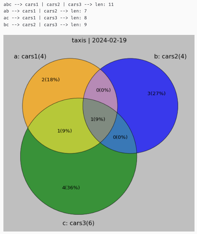
# show venn diagram for 3 sets
from pandas_plots import ven

set_a = {'ford','ferrari','mercedes', 'bmw'}
set_b = {'opel','bmw','bentley','audi'}
set_c = {'ferrari','bmw','chrysler','renault','peugeot','fiat'}
_df, _details = ven.show_venn3(
    title="taxis",
    a_set=set_a,
    a_label="cars1",
    b_set=set_b,
    b_label="cars2",
    c_set=set_c,
    c_label="cars3",
    verbose=0,
    size=8,
)
tags
#pandas, #plotly, #visualizations, #statistics
Release history Release notifications | RSS feed


Download files
Download the file for your platform. If you're not sure which to choose, learn more about installing packages.
Source Distribution
Built Distribution
Hashes for pandas_plots-0.11.0-py3-none-any.whl
| Algorithm | Hash digest | |
|---|---|---|
| SHA256 | ea6392daeda69a84fbd3ddb5ebadbf972b40d161695f2cff4479dfd9b88e8b9a |
|
| MD5 | 1efebe655e920893d19f7da8f50056ad |
|
| BLAKE2b-256 | 9d2cb5dfcdbcde18c3aff133963959986c2b6439ce7be6c199100b5479730aa5 |


